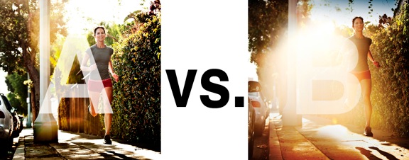
I was just recently commissioned for a campaign and shot about 1000 images to capture final image for this well known sports company. In the end, it came down to the two images above. As is usually the case, the final image is tough to choose, with lots of factors under consideration, lots of stakeholders picking their favorite. There was much debate.
I’ve posted stuff like this before and was really excited by the resulting discussion, so I figured I’d throw it out there again… WHICH IS BETTER, A or B?
Vote in the comments. Love to know ‘why’ if you care to explain your thoughts. 600 px wide versions of each image after the jump…hit [‘continue reading’ below]. After you all weigh in, I’ll tell you which one was used and why.
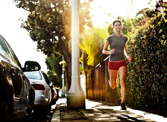
This is PHOTO A, below.
THIS is PHOTO B, below.
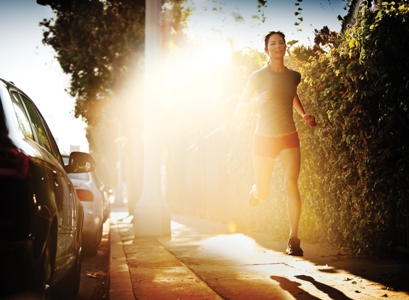






A for commercial or advertisement I definitely think A. You could imagine yourself being that person jogging down the sidewalk. You can imagine yourself In her shoes. Lol no pun intended. It gives you a sense of where you are where the jog is taking place. Pic B let’s your mind wonder to much it bothers me that I don’t know what’s behind her. Which in sense distracts me from what she is actually doing.
A for me.
I think A is better.
A.
Better smile. Less flare.
Photo A.
The flare in B overwhelms the shot.
seeing as a lot of your work is lifestyle based, I’m a huge fan of B, I think it looks like she’s bursting out of the light, it makes me want to get out and run on a sunny morning, the whole image has emotion.
The flare’s fine, I think it works for this shot.
Opposite my house there’s a park and in the morning when the sun’s rising it comes through the trees like this, sadly there’s hundreds of school kids in the way but i’ve always wanted to shoot it and this is how i imagine it would look.
Go B!!