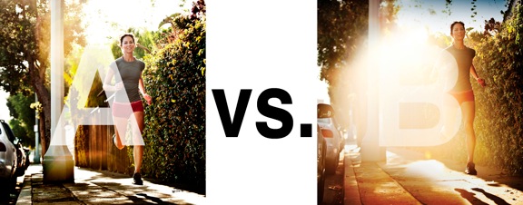
I was just recently commissioned for a campaign and shot about 1000 images to capture final image for this well known sports company. In the end, it came down to the two images above. As is usually the case, the final image is tough to choose, with lots of factors under consideration, lots of stakeholders picking their favorite. There was much debate.
I’ve posted stuff like this before and was really excited by the resulting discussion, so I figured I’d throw it out there again… WHICH IS BETTER, A or B?
Vote in the comments. Love to know ‘why’ if you care to explain your thoughts. 600 px wide versions of each image after the jump…hit [‘continue reading’ below]. After you all weigh in, I’ll tell you which one was used and why.
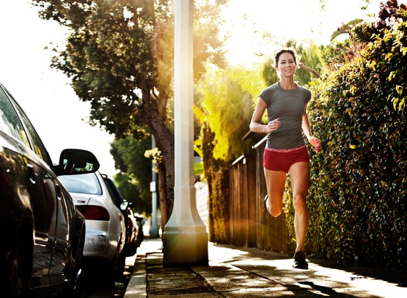
This is PHOTO A, below.
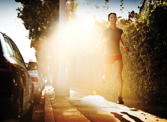
THIS is PHOTO B, below.



The obvious choice is “A” based on general photographic design principles. HOWEVER, I really do not know the message the sports company wants out of the photo. The photo that best accentuates and conveys the message wins. Thanks for this opportunity Chase!
Photo ‘a’
I personally don’t like the flare in photo ‘B’
‘A’ has me looking at the runner, taking in the details. I like it. I could see this being an excellent photograph for an ad.
‘B’ has me more interested in the car on the left. I feel the model is overshadowed by the flare.
Actually… Now that I look at it again the flare in B causes my eye to sort of flow through the image, from the car to the girl and around in circles, while the pole in the middle of A is -slightly- distracting.
I still like A more.
If it will be used for print ad, B gives you more “white Space” for text/graphics and washes out the street light pole, sidewalk and the white car. Pulls the black car out of deep contrast and suggests the runner and feel of early morning fresh run rather than “bam!” cute runner chic in photo A.
Very Lululemon look to it….Hmm?
A is a cleaner image, the glare in B is very distracting, with photos your eyes are drawn to lighter parts of an image but this light just blows the picture out too much. From a commercial point that light might be right for overlaying text to get the message across to the audience Like Just do it. I’m intrigued to find out which one wins.
I’m going to go with “A”, since this is for a sports campaign. I’m usually a fan of a lttile over exposure, and heavy lens flare. However, If the flare in “B” was a little toned down behind the runner, I would say go with “B”. It dominates the photo too much.
Thanks for asking our opinion Chase!
Ilike the sidewalk and how it is lit, with the runners shadow in “B”. Maybe a composite of the two?