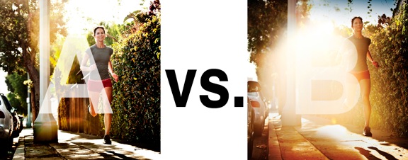
I was just recently commissioned for a campaign and shot about 1000 images to capture final image for this well known sports company. In the end, it came down to the two images above. As is usually the case, the final image is tough to choose, with lots of factors under consideration, lots of stakeholders picking their favorite. There was much debate.
I’ve posted stuff like this before and was really excited by the resulting discussion, so I figured I’d throw it out there again… WHICH IS BETTER, A or B?
Vote in the comments. Love to know ‘why’ if you care to explain your thoughts. 600 px wide versions of each image after the jump…hit [‘continue reading’ below]. After you all weigh in, I’ll tell you which one was used and why.
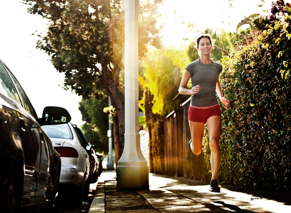
This is PHOTO A, below.
THIS is PHOTO B, below.
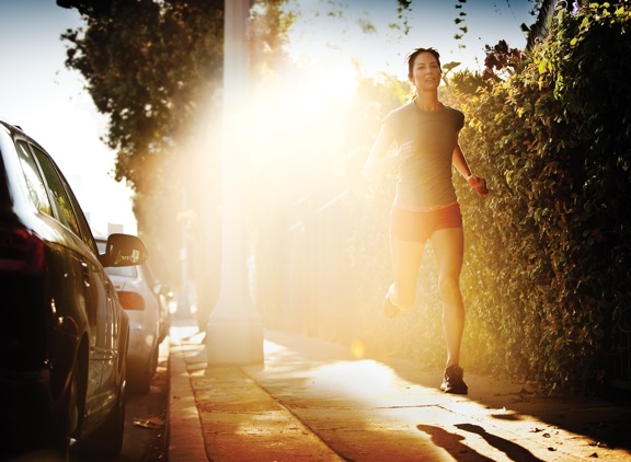





I prefer photo A. The flare is too much in photo B. The only thing in the second photo that I like better is her back leg because you can see more of her foot. The flare is too large and washes out the photo. You can’t see her apparel as well.
Large flare is popular right now but I don’t like it when it takes over as the subject.
The Fonz says “A”.
C
https://www.facebook.com/photo.php?fbid=10204221571478837&l=4e5665946b
A is my choice
B wins for an advert photo but I would love a combination of the flare from B and the composition of A. The flare works well for a logo to be placed in it (a white or off-white tick of Nike for example) but the head of the runner is too close to the top of the frame so A wins in composition, although the flare also has the benefit of hiding the lamppost.
Not sure why there’s a vignette on the top of the frame in B but it kinda looks like something in the foreground was obstructing the shot but hasn’t been fully cropped.
Maks, you just copy from the comment above you? What a crock you are.