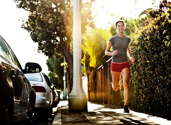
I was just recently commissioned for a campaign and shot about 1000 images to capture final image for this well known sports company. In the end, it came down to the two images above. As is usually the case, the final image is tough to choose, with lots of factors under consideration, lots of stakeholders picking their favorite. There was much debate.
I’ve posted stuff like this before and was really excited by the resulting discussion, so I figured I’d throw it out there again… WHICH IS BETTER, A or B?
Vote in the comments. Love to know ‘why’ if you care to explain your thoughts. 600 px wide versions of each image after the jump…hit [‘continue reading’ below]. After you all weigh in, I’ll tell you which one was used and why.
This is PHOTO A, below.

THIS is PHOTO B, below.


A is more technically correct … But B takes the runner out of her element. I’m way to distracted by the cars in A! So B is my choice ! Sunny SoCal sunset !
No offense, but I’m not a fan of either image as-is. “B” is really unusable with the flare in the middle of the image that obscures the subject. It does block out the streetlight, but it just looks too unnatural. “A” has too many distracting elements. If you cropped image A with everything from the streetlight left being deleted, you might have a usable image. Thanks.
I fear it will be B, as that will make for the most controversy. I detest that so-called effect using exaggerated flare. That used to simply be considered a bad photo, an out take! So hoping for A, this is such a strong example of this overused bad effect that it is even hard to look at. But maybe the company thinks it will make people look as they wonder why they are seeing a bad photo in print. My thought on that logic is, I may look twice but when I realize the co chose that to attract their buyers, I would be turned off towards the company and their products for having such an off putting ad. I don’t want to look at a glaring annoying photo and I will associate that annoyance with the product and never buy it. It’s an insulting advertising ploy IMO.
B gives a sense of mystery and feel of energy I don’t get from a that feels static with too much detail
A is better, but B was probably used. Brands are looking for easy text and the “feel” if the photo. The “it could be me” factor. Plus it’s no longer about the shoe in a wide framed shot; it’s about what she shoe will provide.