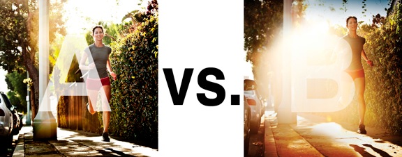
I was just recently commissioned for a campaign and shot about 1000 images to capture final image for this well known sports company. In the end, it came down to the two images above. As is usually the case, the final image is tough to choose, with lots of factors under consideration, lots of stakeholders picking their favorite. There was much debate.
I’ve posted stuff like this before and was really excited by the resulting discussion, so I figured I’d throw it out there again… WHICH IS BETTER, A or B?
Vote in the comments. Love to know ‘why’ if you care to explain your thoughts. 600 px wide versions of each image after the jump…hit [‘continue reading’ below]. After you all weigh in, I’ll tell you which one was used and why.
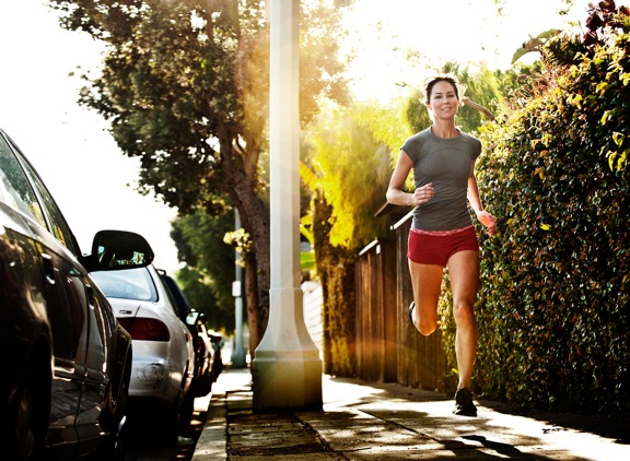
This is PHOTO A, below.

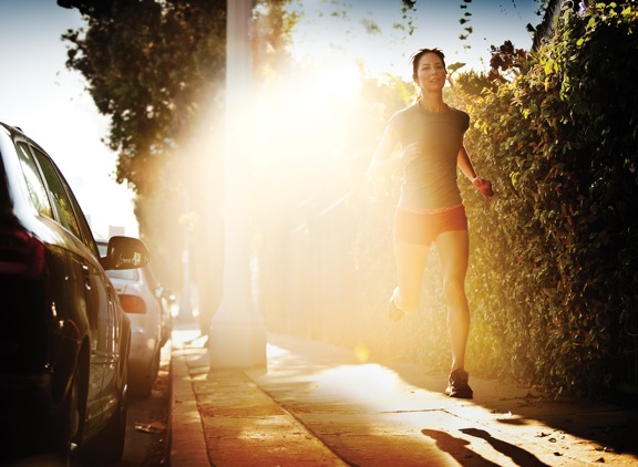
THIS is PHOTO B, below.


I prefer A.. B looks like a post edit that’s to extreme. Either a masked out curve that’s to blatant or a LR Radial custom brush. To predictable edit for me…I just like the plain old and is not a over done post edit. It does not look natural like it was in camera affect by the light and lens itself.
Easy B. It’s a sports magazine. Why would you want a picture like A that looks like any other normal picture, where picture B looks like she is “running on air” The flare might be too much but accentuates the scene better than A.
I would not have even presented B, it’s a throwaway.
A is a great photo of sport action, B is unreal, a blaze of light, too much…
Photo B is better for me, because it draws my eye to the girl running. In Photo A, I find my self looking at the black car on the street, but the flair in B brings me up to the main focus which is the runner.