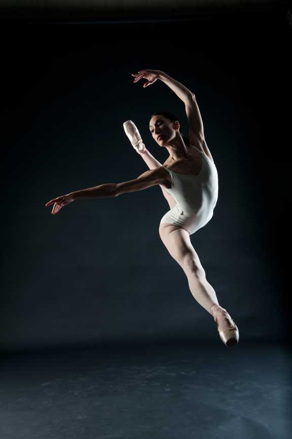
 Thanks to the hundreds of you who wrote in to take a stab at how the ballet image was made [note that this thumbnail here is a crop, not the final…go to the original post to see that one]. A handful of you nailed it to varying degrees. Here’s my breakdown of shot:
First, this was not a snapshot. Anything I’d list that would be of interest has been planned, choreographed Second, this image was NOT shot through the our ground control plexiglass setup. This is an actual dancer, actually leaping, actually caught at the apex of her jump, and actually with that perfect expression, body mechanics, etc. There is no trickery going on here, it’s a real moment.
All the details, full breakdown and and gear list, plus the original image as it came out of the camera after the jump. Hit ‘continue reading’
Equipment/Gear
Camera: Nikon D3
Lens: Nikkor 24-70mm 2.8 (shot at 45mm)
Lighting: Broncolor Scoro Pack, 2 Pulso Heads, 2 Chimera Softboxes – 1 large, 1 medium.
Why?
The D3/s/x is my workhorse and perfectly suited for this. Although I’m not making use of any autofocus technology, it has an incredibly short shutter lag – perfect for nailing the apex of the jump. Prime lenses are nice, but in this case the zoom lens was more than adequate. It gave me some flexibility with composition as the dancer performed numerous jumps. The Broncolor setup has the quickest flash duration of any of the pro lighting setups – exactly what I’m counting on for stopping action.
Exposure/Strobe
The camera was set to F/11, 1/250 of a second at ISO 200.
Why? This was dictated by a few things. Shutter speed’s fastest sync on the D3 is at 1/250 (technically 1/320 with some custom tweaking, but unnecessary…). I then balanced the pros/cons of the aperture and ISO. I needed enough depth of field to get the dancer entirely in focus, front to back. My preference was to keep the ISO as low as possible to create a noise free image. And I also wanted to keep the ambient light/scene rather dark (so that my strobe light would fall off rather quickly). My original guess at this magic combination was F/11 for the depth of field. When I got what I was looking for, we played with ISO and arrived safely at 200 to get the overall desired results.
Set/Setup
The set is a simple black seamless paper. Matte finish, rolled out, posted on C-stands and gaff taped to the floor. Two softboxes lit the subject, one to the left, slightly behind and slightly above the centerline of the dancer, another to the right and slightly in front and below the centerline of the subject.
Why? The black seamless is obvious – I clearly wanted there to be essentially no background. This shot is all about the dancer. The lighting is as such for a number of very specific reasons, all of which fall into the category of defining and sculpting the subject. You’ll notice every essential part of the dance expression is seen and yet there is enough shadow to create depth and dimension to the image–just the right amount of wrap with the softboxes. Muscles are shaped, there’s a sufficient backlight from the left softbox, and there’s even a catch light in the eye. This lighting schematic was the result of a lot of trial and error. I knew I couldn’t get what I wanted out of one light. Not enough depth, shape. Alternatively I could have brought in 23 other light sources and micromanaged them to death. But for this shot, two was right. And generally, I prefer to try to do more with less. If I had got to this point and saw that I was still in need – THAT’s when I’d have started adding lights. My personal preference told me this was nailed.
Treatment: black and white conversion was done in Photoshop. Mostly curves and channel mixer and b/w layer for the contrast and tone. It was not massaged too much because it wasn’t required.
Why? The photograph was part of a study I was doing to demonstrate my ability to make beautiful black & white images of dancers in action. It was originally in accordance with some conversations I’d been having with the NYC Ballet, but it went on to be a dance study of my own that included a bunch of other dancers, styles, etc.
This is the original capture as it came out of the camera.
Dancer Photo for NYC Ballet Study”]
So that’s about it. We’ll reach out to a couple of you got closest to how it actually when down and pass along a signed book or something as a thanks for playing. Holler with questions.


As I position possessor I deem the content substance at this point is rattling fantastic , value it for your hard composition. You should keep it positive forever! Greatest of luck.
Late reply here, I saw the question back then but never the answer! I have to admit I prefer the original image. I find cleaning up the background and the floor when shooting dancers is always tricky. To me it adds some sort of three dimensional coordinate system that allows to truely appreciate the dancer’s skill. Inside this coordinate system I can see the incredible height of the jump, how in line her feet are and how graceful she is in that very exact moment. Without, she could almost be doing a split on the ground and it would look similar. Just my opinion of course, 🙂
I am now forced to go and take another look at the original post to understand how I came to the conclusion of my analysis, although I don’t think I was too far off. I assumed only one softbox and ambient light. I am bedazzled about no Plexiglas, because that was my first entry I think. Good stuff. What I learned here? To definitely record all my settings and see if I can recall them later on.
Chase – I agree with others that the black and white version is more powerful than the color. What software did you use for the conversion?
thanks for sharing chase, the Scoro is truly awesome