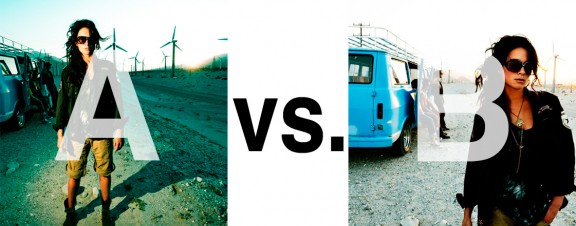
Alrighty. Regardless of the fact that this A or B series (here, here, and here) has been really interesting for us, helpful, and popular with you (the last such post received over 1000 comments in 24 hours)…
This time it is of even greater interest for us. You see, we’re doing some image editing around here and we’ve stumbled into a little internal debate about which one of these two images is actually better, A or B. [You might remember these shots from the Nikon D7000 campaign…]
Hearing from you will help really help us. No qualifiers, don’t worry about our objectives, or the “assignment”. We want to know which one of these shots you like better. And please tell us in the comments below, not via twitter. Raw preference. Period. If you can add some “why”, that would be nice too. Full 600 pixel wide images after the jump. Hit ‘continue reading’ below [and btw, I’ve got a $1 gentlemen’s bet riding with Erik about which one will win, so don’t let me down!]…
After you all weigh in, I’ll tell you which one I like, which one I thought you’d like, and why.
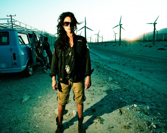
This is image A, below:
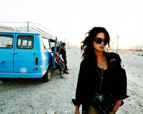
This is image B, below:
So which photo is better? A or B?




Well I would choose A. the composition, though equally the fans making a photograph horizon and reaching back makes it look a lot more depth, the sun flashing gently on the mountains make a point of focus on them. The shadow of the model emphasizes a more and gives you a space on the photograph belongs only to her … of the rest .. Just a great photo .. PD .. Juan Carlos Silva .. VENEZUELA ..
Image A hit me straight away i love the texture, colours and composition the turbines are very clear and add a very unusual almost clinical and modern feel to the photograph i also believe that the lighting used on the subject has created a stronger narrrative as half it is rather harsh on the left of her face creating the notion of a split personality almost. photograph b in my opinion is slightly lack luster and has an overexposed feeling to it although this leaves more focus on the subject there is less texture and i think is nothing in comparison to photograph A. really love this photograph reminds me of the ones you did for the 2007 hasselblad masters slightly and i think that adding a red tint to her hair could make it an even more interesting piece!
I like B because the model seems to have more focus. In A, the background seems to have equal emphasis with the model.
B
B. While the model is the center of attention in both, there seems too much going on in A for the viewer to get any sort of message, intended or otherwise. More nitpicky, but I don’t know it the wide angle is used to its best effect in A.