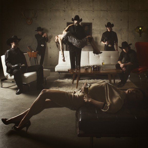
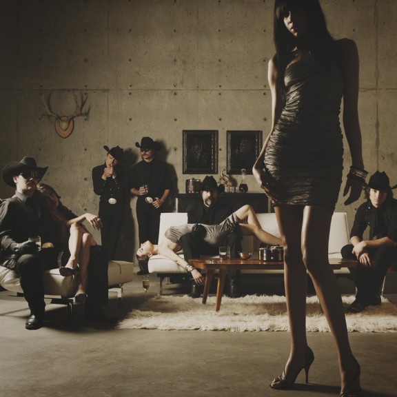
Remember when I did the original chasejarvisLIVE photo shoot way back in winter? If you recall, I was shooting the album cover image for alt/punk country band Brent Amaker and the Rodeo. We also did post production and editing on the images LIVE as well a few weeks after the shoot. Well now it’s time to print these suckers on a limited edition run of vinyl and there is somewhat of a debate on which image is better.
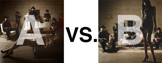
Simply put, and with no further explanation, I thought I’d ask for your thoughts. So which is better, A or B?
Vote in the comments. Also love to know ‘why’ if you care to explain. 500 px wide images after the jump…
[ also, reminder that if you like music and you like chasejarvisLIVE, I’m hosting rising hip hip star RA Scion (of Common Market and Victor Shade) TODAY in 90 minutes at 10:30 pacific/1:30 eastern (GMT – 8). Interview with RA and Village Voice/Time Out/Stranger cultural critic Charles Mudede, plus RA performs LIVE at the end of the show. Hope to see you http://www.chasejarvis.com/live today….]A. With the foreground lady laying down…

OR.
B. With the foreground lady standing up…
Love to hear your thoughts.


“B”, it has more story to each member, doing their thing. On “A” the band members are too plain, period.
B, Honestly, because I looked at it more before I even read what the blog post was about. And after finding out, didn’t change my opinion, so technical aspects aside, it just reached out and grabed my attention more. I guess both would work, but I think B has the potential to become more classic. I like that she is so dominating in the image because she breaks up the tones of the cover, otherwise I feels looking from a distance at a CD cover, A would just seem… tan.
Super late chime in:
I’m going to be a meany and say I don’t like either. I think they both have to much of the same size objects if you catch my drift. There is only dominant and sub-dominant. B is getting close because the girl in the foreground draws you in, but once you are in you completely stop once you hit the couch and other peeps. I needs foreground, middle-ground and background (or dominant, subdominant and subordinate).
There is an intense depth with the light and darks that for me it begs to have depth from the subjects and surrounding. The color and texture reminds me of renaissance paintings (yeah it may be a stretch, but it does) and if you study those paintings there is an incredible amount of story and sometimes movement in what is ultimately a still image. The compositions are complex and full of depth. That is what I’m looking for when I’m looking at these photos.
I agree with an earlier poster that it doesn’t really have to showcase the band members as much as it has to be visually interesting.
Sorry for doggin’ your work! I usually really like what you produce.
A picture) as just a photographer everything you want see is in one location and good focus points. the B picture has to much unused space.
B picture) to sell as product it has more sexy eye pulling to the women in the picture with the band being more playful
I choose B.