
I was just recently commissioned for a campaign and shot about 1000 images to capture final image for this well known sports company. In the end, it came down to the two images above. As is usually the case, the final image is tough to choose, with lots of factors under consideration, lots of stakeholders picking their favorite. There was much debate.
I’ve posted stuff like this before and was really excited by the resulting discussion, so I figured I’d throw it out there again… WHICH IS BETTER, A or B?
Vote in the comments. Love to know ‘why’ if you care to explain your thoughts. 600 px wide versions of each image after the jump…hit [‘continue reading’ below]. After you all weigh in, I’ll tell you which one was used and why.
This is PHOTO A, below.
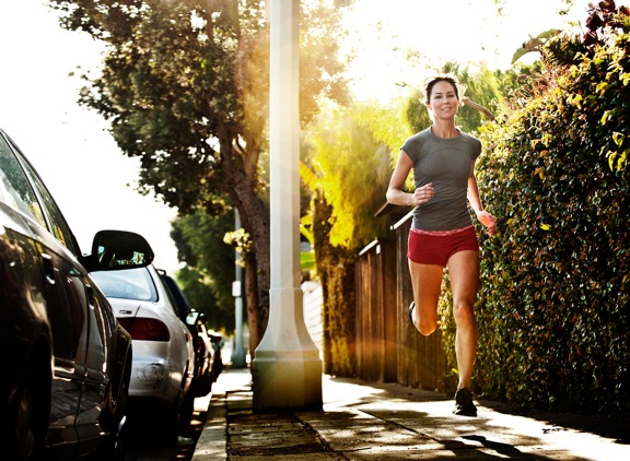
THIS is PHOTO B, below.









A for the win, the flare in b is too distracting
I have learned that to judge a photo that is going to have text added, with out knowing where the text, is going to go is difficult. Truth be told A seems a pretty boring picture, B is much more intestting, but the flare is too strong. I would personally dial down the flare a bit.
It seems to me both of those photos are a compolation of the background, and the same runner, just exposed differently to match the backgrounds. If that is truely the case, move the runner a little bit to take her out of the flare, and that would be my choice.
Hey Chase,
I would go for A.
B to me is too busy and doesn’t show the details as well as A.
H.
They’re quite different and you obviously like B despite most people probably favouring A.
I reckon you favour B, the shadow is nice the sky clearer and I like that you don’t have the woman smiling.
Personally would have toned down the flare and gone for B with the logo in the middle of the shot.
Nice work.
Definitely A. B is too over the top distracting and looks like an error of some sort, not a sun flare.