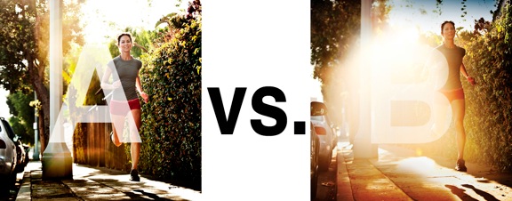
I was just recently commissioned for a campaign and shot about 1000 images to capture final image for this well known sports company. In the end, it came down to the two images above. As is usually the case, the final image is tough to choose, with lots of factors under consideration, lots of stakeholders picking their favorite. There was much debate.
I’ve posted stuff like this before and was really excited by the resulting discussion, so I figured I’d throw it out there again… WHICH IS BETTER, A or B?
Vote in the comments. Love to know ‘why’ if you care to explain your thoughts. 600 px wide versions of each image after the jump…hit [‘continue reading’ below]. After you all weigh in, I’ll tell you which one was used and why.
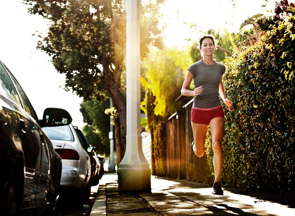
This is PHOTO A, below.
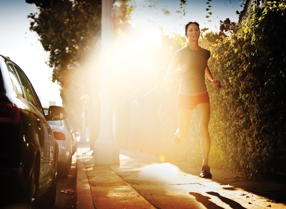
THIS is PHOTO B, below.





The glare on A is perfect ! Fence, details
B take too much distraction, can’t see the nice fence on B
Photo A is neatly-composed and I like that my eyes were easily drawn to the jogger however, I do find the photo quite ordinary.
Photo B caught my eye first but I think the amount of flare is just too much. It kind of “divides” in the middle too and I think that if I saw this ad in a magazine or say a billboard, I might have a hard time figuring out what was being endorsed. Maybe a smaller amount would do the trick? Nevertheless, you have nice photos Mr. Jarvis. 🙂
I vote for Photo B since it stands out quite a bit for me.
A by far
I like A Better.
Both are wonderful shots.
I go for B. I see more speed in it, more dynamics. It fits the theme of the photo. A is too balanced for me.
I would rather see her foot hit the pavement, by the way.