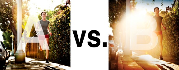
I was just recently commissioned for a campaign and shot about 1000 images to capture final image for this well known sports company. In the end, it came down to the two images above. As is usually the case, the final image is tough to choose, with lots of factors under consideration, lots of stakeholders picking their favorite. There was much debate.
I’ve posted stuff like this before and was really excited by the resulting discussion, so I figured I’d throw it out there again… WHICH IS BETTER, A or B?
Vote in the comments. Love to know ‘why’ if you care to explain your thoughts. 600 px wide versions of each image after the jump…hit [‘continue reading’ below]. After you all weigh in, I’ll tell you which one was used and why.
This is PHOTO A, below.

THIS is PHOTO B, below.








If I’m selling shoes, I have to go with B. Photo A is too much about the model and not enough about the product.
I think it all depends on the context of the ad campaign, but I think B is a more powerful image.
B is my vote.
A has better commercial / advertising approach, since subject is more clear of distraction and as an observer, my vision goes straight at the running lady.
B is better for editorial purposes. There is more feeling, more mood and abstract concept implied.
A! B looks blown out, and you’re better than that 😉
B looks like a darkroom accident. I mean, seriously…
A gets my vote.