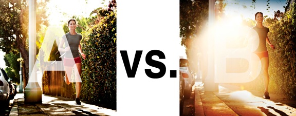
I was just recently commissioned for a campaign and shot about 1000 images to capture final image for this well known sports company. In the end, it came down to the two images above. As is usually the case, the final image is tough to choose, with lots of factors under consideration, lots of stakeholders picking their favorite. There was much debate.
I’ve posted stuff like this before and was really excited by the resulting discussion, so I figured I’d throw it out there again… WHICH IS BETTER, A or B?
Vote in the comments. Love to know ‘why’ if you care to explain your thoughts. 600 px wide versions of each image after the jump…hit [‘continue reading’ below]. After you all weigh in, I’ll tell you which one was used and why.
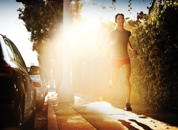
This is PHOTO A, below.

THIS is PHOTO B, below.






A A A
Chase,
Rather than wading into the “A vs B” discussion above, I want to challenge you to go back to your purpose. How can I answer which is better without knowing the design brief / objectives of the ad?
If the brief says “we want to show a strong, powerful women who is comfortable with herself and her place in life”, or “it’s about our running shorts”, then image A is your winner.
If the design brief says “Give me a big blob of negative space in the middle of the page, so that I can put in text”, or “it’s about late afternoon running, but de-emphasize the subject”, then image B is your baby.
Love your work and your approach.
Choice A for sure. Like it nice and clean, brings out the runner more.
A for her face and rim light on her hair. The cars are really distracting; I hope the add gets a square crop like the thumbnail. And what’s with the shoes?
I find myself looking at B for a longer period of time.