
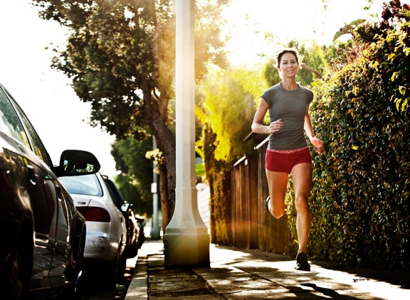
I was just recently commissioned for a campaign and shot about 1000 images to capture final image for this well known sports company. In the end, it came down to the two images above. As is usually the case, the final image is tough to choose, with lots of factors under consideration, lots of stakeholders picking their favorite. There was much debate.
I’ve posted stuff like this before and was really excited by the resulting discussion, so I figured I’d throw it out there again… WHICH IS BETTER, A or B?
Vote in the comments. Love to know ‘why’ if you care to explain your thoughts. 600 px wide versions of each image after the jump…hit [‘continue reading’ below]. After you all weigh in, I’ll tell you which one was used and why.
This is PHOTO A, below.
THIS is PHOTO B, below.
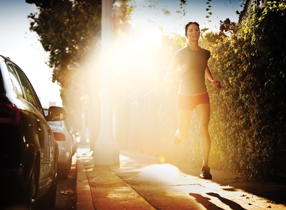








Because of the distracting flare photo B is a unique proposition.
My vote is for B. Here’s why.
I think A displays the runner more clearly. It gives a more natural everyday look to the image, while B is too flare-y and distracting. However, even though A is obviously clearer, I think the pole that splits the frame is less aesthetic than the flare in image B. I also like that the runner’s head is in the clear of the sky in image B, with no major greenery around her hair.
Result: my vote is for image B.
A, I don’t like the intensity of light in B – it is too strong.
I like A better. It’s more clear and B looks like there is just a giant sun spot in the middle. I’d pick A =]
If the client was a sports company then photo B was chosen. The glare is sufficient enough to blur out the lamp post & draw your eye to the athlete, which is the objective. Also the huge glare adds to the drama, as if the athlete is bursting through a mist or fog. She is caught with both feet off the ground (almost like levitation) to create an even greater impact. Plus, I really like her shadow cast on the ground, it also gives an ethereal effect to the whole image.