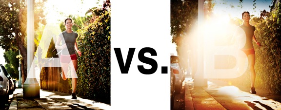
I was just recently commissioned for a campaign and shot about 1000 images to capture final image for this well known sports company. In the end, it came down to the two images above. As is usually the case, the final image is tough to choose, with lots of factors under consideration, lots of stakeholders picking their favorite. There was much debate.
I’ve posted stuff like this before and was really excited by the resulting discussion, so I figured I’d throw it out there again… WHICH IS BETTER, A or B?
Vote in the comments. Love to know ‘why’ if you care to explain your thoughts. 600 px wide versions of each image after the jump…hit [‘continue reading’ below]. After you all weigh in, I’ll tell you which one was used and why.
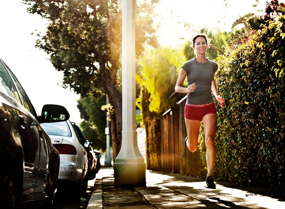
This is PHOTO A, below.

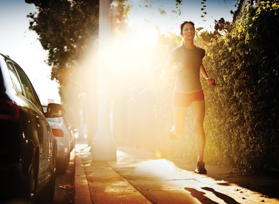
THIS is PHOTO B, below.


Prefer B with that floaty ethereal look. A may show more of the model, but that lamp post and clarity of parked cars look distracting.
I like B because despite having the strong presence of the flare , it attracts your attention and isn’t a forgettable image.
It looks like the runner is being propelled forward by this strong morning energy at sunrise. An inspiring shot..
I’d go with “A”. The composition I think is better, and the shadow from her running is great along with the plants and car shadows. It works. Photo “B” that light is kinda to harsh I think, and it blows out the shadows from the plants which I enjoy.
B – If the purpose of this is for an ad, say in a magazine, then the power, the expression, and the light are perfect and the huge highlight in the center leaves a perfect space for the graphic designer to lay out the campaign’s catchphrase, logo, whatever.
I feel like most people picking A are doing so because they have been brainwashed in to what makes a good photo.
The best photo is the photo that is right for the situation.
I think B is more powerful, the woman seems to be coming out of ball of fire, traveling faster than the speed of light.