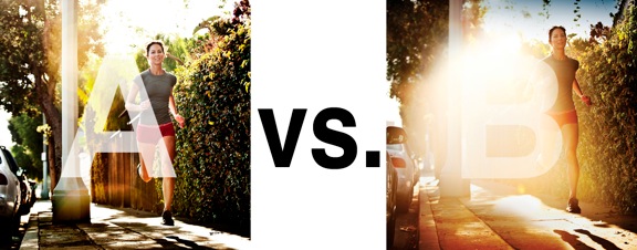
I was just recently commissioned for a campaign and shot about 1000 images to capture final image for this well known sports company. In the end, it came down to the two images above. As is usually the case, the final image is tough to choose, with lots of factors under consideration, lots of stakeholders picking their favorite. There was much debate.
I’ve posted stuff like this before and was really excited by the resulting discussion, so I figured I’d throw it out there again… WHICH IS BETTER, A or B?
Vote in the comments. Love to know ‘why’ if you care to explain your thoughts. 600 px wide versions of each image after the jump…hit [‘continue reading’ below]. After you all weigh in, I’ll tell you which one was used and why.
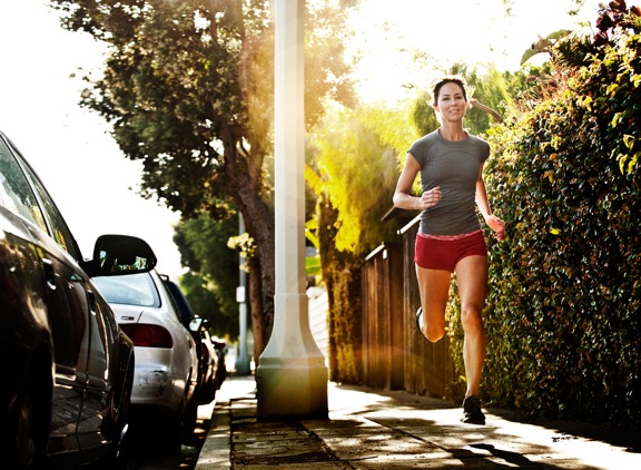
This is PHOTO A, below.

THIS is PHOTO B, below.


A for me. I can’t figure out what B is trying to tell
I vote B. The flare adds a punch to the sports theme. It depicts the most common and most enjoyable place of doing sport or exercise for that matter, that is out in the world, under the abundance of sunshine and pleasant atmosphere where all natural elements abound to make your task even more enjoyable.
B is the clear choice.
It conveys motion entirely – and does not have the static objects of the light pole and parked cars in such detail.
I suppose the best photo depends on what the clients’ remit was, the message / connection they’re looking to communicate with current and future customers, re product / brand / positioning.
A: Sets a scene of a runner that is focused, has a goal to achieve, sharp, clinical but is less appealing.
B: Natural, dreamy, enjoying the moment, speed but care free.
Both photos are good for different reasons, but my personal preference is “B” I like the flare, it’s interesting and has character and grabs my attention.
Good luck choosing.
I love photo A, but for promotional reasons B is my preffered.
B photo has a clean open space available for text and information to be positioned. The flare of light draws the viewer as it’s like a flashlight being shone in your direction, the key to getting clients to view your work is for it to pop, but by also providing an interesting subject you capture your audience for a longer time!