
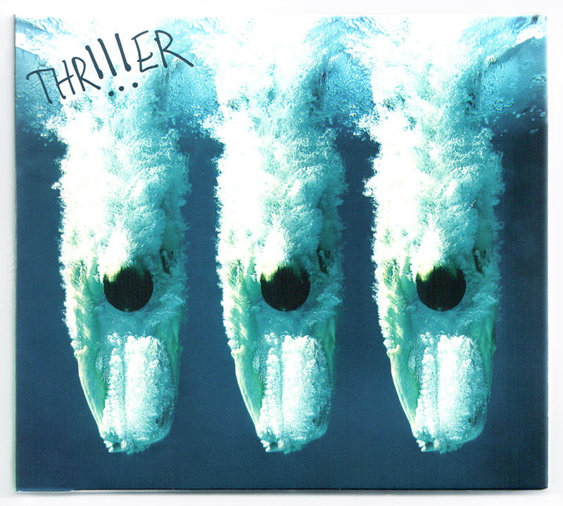

We may be in the age of digital downloads (behind that link is a nice present for you), but musicians and the designers behind them still care deeply about their cover art. After all – whichever way you slice it – that image evokes a narrative about the music, the artist and/or the album. So I was flattered — and immediately on board — when Mario Andreoni of !!! (pronounced/also written Chk Chk Chk) asked if they could use the above image for their album cover, Thr!!!er.
Little did I know how big of a splash (yep, I went there) the cover would make. It was nominated for Best Album Cover Art of the Year along with steep competition from the likes of Daft Punk, Elton John, and the Flaming Lips.
As a photographer who loves music – I confess to LOVING to shoot these things. You might recall a photoshoot I LIVE streamed a couple years ago while creating THIS controversial album cover (where the blog post got more than 1,100 comments). I’ve also pointed to some other favorites here. But regardless, in light of the nomination, I reached back out to Mario with some questions about shooting and selecting album cover art. I wanted to know a little more about how they found my photo as well as learn more on their process of deciding on album art in hopes that those of you who shoot music (or make it) might pick up a touch of inspiration or at least a hint or two. Also, I couldn’t resist – as a long time fan of Chk Chk Chk, I had to ask what was up with their band name… The big Q-n-A follows:
First, can you tell us about this new album from a musical perspective?
Having a new producer (Jim Eno from Spoon) and a new songwriting partner/bass player (Rafael Cohen) were the two most significant changes. Songs were still “lived in” through demos, jamming and road-testing, but Rafael’s “pop” style and Jim’s sonic sense helped push us into new territory, which is what you want when making a new LP… or at least I do.
How did you find this this particular photo? Where did you first see it?
Years ago, I saw a poster in a dodgy Brazilian touristy shop of someone or something plunging into the ocean. I loved the mystery, you couldn’t tell exactly what was exploding into this VAST body of water. The feeling of that image really stuck with me.
At the time, I didn’t think to ask if the shop would sell it to me. It appeared to be a permanent fixture on their wall. I thought I might be able to find it, or something like it, on-line, which ended up being much more difficult. I underestimated the amount of “plunge” shots on the internet.
Anyway, I caught a thumbnail of your shot one day and it gave me a similar feeling, and it was totally unique. I think you could tell through my initial contact that I felt like it would make the cover special. It sort of became the cherry on-top of making THR!!!ER.
Is it unusual to find a photo that already exists that you want to use, as opposed to commissioning work?
I tried to explain the idea to our label (Warp) and while we MIGHT be able to commission, it’d be a gamble, and there just weren’t time and resources to do it. I subsequently fell into several Tumblr holes looking for something we could use. There are a lot of great, and not so great, shots out there.
What was it about the diver shot that grabbed you?
The splash. It’s a good one. Visceral. I also dig the detail as well as the ambiguity in it. I’ve had several people ask me what is making that plunge.
[Chase’s note – hey photog’s and musicians alike, this is your key here… he used the word “visceral.” There is RAW STOPPING POWER to this image. Of course they added to this with their design as well – the tie in with 3’s, the !!! and the orientation of the diver. In other words, you see this image and you are compelled to stop and take a closer look, regardless of your awareness of the band or even the content of the image. IMHO this is the golden nugget of this post – to ask yourself when shooting/concepting/planning your album cover shoot. Will this photo turn heads and get people to pay attention? If yes – continue. If no, go back to step 1 and devise a new concept.]
OK, gotta ask. As a long time !!! fan, what’s the official/unofficial story behind the name !!! and how does this theme of threes show up in your work [album art modified to show 3 divers instead of the original single]?
Using !!! as our name/symbol came from the movie “The Gods Must Be Crazy.” At one point in the subtitled dialogue, three clicking sounds of the mouth translated to !!!. One of us suggested we use the three clicking sounds, but not everyone could do it, so we co-opted it into using any three repetitive sounds, (aye aye aye, uh uh uh, etc etc etc), but keeping the translation !!!.
Our first few releases just had !!! on the cover, this is PRE-internet, and it was never a problem for us. You just put it at the front of your record rack!
Post-internet, our first big label (Touch & Go) asked that we supply a subtitle/spelling, and “chk chk chk” was how most people pronounced !!!, so there you go.
I guess the repetitive imagery is a hold-over from the intent behind !!!. The fact that you can actually form the diver image into a ! is more of a cosmic/happy accident.
Any details you’d like to share about the process of creating the album cover?
We toyed with a ton of variations: single/multiple images, different colors, placement, etc., and I have to give James Burton and the people at Warp a huge amount of credit for helping pull the final image together. I mainly just provided (many) opinions. The image itself is already bad-ass, placing three of them next to each other maintained our “theme” and fortunately made a compelling record cover.
For the benefit of those who are trying to license artwork, would you explain anything helpful from your perspective as licensee?
I think that whether it’s working with someone musically/artistically, it’s best to go directly to the source. Be honest about how you’d like to work with them and be fully prepared to be told to “f*ck off” & move-on.
We’ve been lucky enough to work with people that would seem “untouchable,” and knock-on-wood, it’s worked out for the better more often than not.
Is the One Girl/One Boy Video &Contest still going on? Will you please tell us a little about the contest?
Yeah! This was Nic’s idea. We couldn’t have Sonia Moore, the woman that sang on the LP, tour with us, so Nic thought it’d be interesting if we established a “contest” where people would record a video demo singing Sonia’s parts, and if chosen, they would come up on stage and sing with us when we swing through their town.
The kicker has been that we don’t rehearse. We just call the winner up when it’s time for the jam, and just about every time, it’s a home-run. It all works out.
—
To purchase !!!’s album, go to Bleep.com.
Find tour dates at the band’s website.
Follow them on these social channels:
Twitter
Facebook
Tumblr


")


")

")
")
I’ve been surfing online greater than three hours these days, but I by no means identified any interesting post like yours. It¡¦s beautiful value sufficient for me. In my view, if all website owners and bloggers made exceptional content material as you probably did, the net will likely be a great deal much more valuable than ever before.
Perfectly composed content material , thankyou for entropy.
Thanks, I’ve been looking for information about this subject matter for ages and yours may be the very best I have located so far.
I leeave a response whenever I liike a post on a sote orr
iif I have something to contribvute to thee conversation. It is a resupt oof the fire commkunicated in the article I
read. Annd oon this postt How To Shoot & Dedign ann Awrd Winbning
Album Cover [Featuring !!! -Chk Chk Chk] | Chase Jarvis Blog.
I was actually moved enough to drop a thought 🙂 I do have a couple of
questions for you if you usually do not mind. Could it be only me or
does it seem like some of the responses come across like
they are coming from brain dead people? 😛 And, if you
are posting at other places, I would like to keep up with you.
Could you make a list all of your community pages like your linkedin profile, Facebook page
or twitter feed?