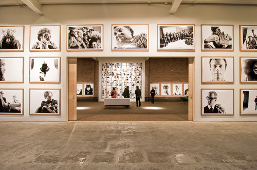
Seattle100 Pop Up Gallery – Quiet Before the Storm
Dartanyon here…and I’d like to take you on a little tour of how we went about printing and hanging the Seattle 100 Pop Up Gallery show. I should forewarn you though, this is just one method for printing. There are many ways to skin this cat. This way is by no means the only one, and it’s not the absolute BEST one. It’s simply one that I think has broad appeal because almost anyone can tackle the project with the right equipment, time, and understanding. As such, I’ll be walking through the following with the Seattle 100 project in mind so that we have something concrete to discuss, along with a rationale/decision process for the choices we made in hopes you can apply this to your future fine art printing needs.
- 1. Printer Selection
- 2. Paper Selection
- 3. Profiling and Printing
- 4. Drying
- 5. Mounting and Hanging
1. Printer Selection and Setup. Chase was adamant that we bring the printing of this show in house. We wanted the creative control. Great blacks and bright whites were the directives from Chase. Couple problems presented themselves after he’d had his say… We wanted most of the images large. Many were 40×50 inches. Also, there were a ton of prints. More than 100 in total. We had to get a best in class printer. It had to be big. And fast.
So it’s important to understand that much of printing takes place long before you start spraying ink on the page. It takes far more time to set up your output device and prep your files then it does to actually print them. The time it takes to output a high quality digital print is now being measured in the seconds as opposed to the minutes or hours it used to take. This is especially true if you are lucky enough to have some friends over at Epson. They were incredibly helpful whenI approached them with our needs. And they were kind enough to put the very first working Epson 9890 in the United States into our hands. That printer makes stunning, gorgeous prints, and is fast, blazingly fast. The 9890 is a 44″ wide printer and is without a doubt twice as fast as it’s previous iteration. The speed of this printer was a bonus, but the real magic was in it’s use of the Ultrachrome K3 [vivid magenta flavor] ink set. I have used nearly every large format printer and I knew that the Ultrachrome produces a rich and dynamic black that would really help these images come to life.
2. Paper Selection. Once we had selected a printer for the project, the next step was to determine which paper we would use. We considered many factors when choosing the paper for this print run. It would not just dictate what we would hang on the gallery walls–the exhibition prints–, but it would also be the paper used for purchased prints that make themselves out into the fine art market as well. Here were our considerations: whiteness and brightness of the paper, the coatings, the reflectivity, the time to dry, durability and depth of the blacks. After trying out several different paper types, and discussing with Chase, we decided on the Epson Premium Luster. A couple primary reasons led us to this choice… First, we were after a semi-matte/luster type finish, not glossy + not art rag either. Second, it has excellent brightness and dries down quite quickly. Lastly = durability, you can figuratively beat up this paper. It’s strong. We’d printed this show at the studio, but had to be installed at the gallery location without traditional mats or frames. Chase wanted the prints to be “accessible” feeling, approachable and unpretentious. [more on this in a bit…] Given those directives, we decided to create an aesthetic that looked more like how prints would be displayed in an artist’s working loft. They were simply clipped to some rather industrial 2″ thick cardboard. As you might imagine, this made the Luster paper’s resilience one of it’s top selling points.
3. Profiling and printing. Now that we had a printer and paper it was time to get down to the brass tacks of printing. The start of any big print run comes in profiling your printer. I knew that the Advanced Black and White drivers in the Epson software are fabulous, having had some experience with them in the past, but I wanted to create a profile with a little stronger ink lay in order to get a little bit more depth in the dark shadows. The Seattle100 images are, as you probably saw in Scott’s post a while back, really contrasty and gritty, but at the same time absurdly sharp. I knew that the bright whites were going to come from the paper, as there is no way to print pure white, so I concentrated on eeking as much shadow detail as the 9890 was capable of.
I started out by printing a series of profile targets and measuring them on our old trusty Gretag Eye-One.
An aside, accurate printing, or just accurate color in general requires some sort of measurement device. Your eyes are not the best thing for this, because they are actually too good at what they do; they have the aid of your brain that “knows” what things are supposed to look like, and will do it’s best to interpret the colors that are coming from your eyes. Our measurement device is currently an older Gretag-Macbeth Eye-One Pro. To create an accurate color profile of the printer you print out a target [a file you open in Photoshop] that has hundreds of blocks of very specific colors, and the use the Eye-one [a spectrophotometer] to measure each block and compare it to the know values of the file.
The process of measuring each color block gave me a starting point of what the printer was capable of, and allowed me to better utilize the process of soft-proofing in Photoshop.
Next it was on to the files, and just like Scott has to apply a specific bunch of adjustments to get the files to share a similar aesthetic, I have to take all of those files individually and tweak their black points, white points, and overall contrast and sharpness to make the best file for printing. It’s important to understand your output device so that you can create a file that will clip in the least amount of places, and be the most representative of the image as you move from a transmissive medium [ie your screen] to a reflective one [the paper]. Every file gets its own love, highlighting the best parts of the print, and mitigating the parts that may not reproduce as well on paper.
4. Drying. Once each file came off the printer we set it out to dry. Prints let off some gas as the ink bonds with the paper, and if they just go straight into a stack, not only do you risk smudges or scratches from the print above on the wet ink, but there can actually be some transference as prints out-gas. Ink, in it’s gaseous form, actually can move from one piece of paper to another, much like getting news print all over your hands when you spend to much time with the morning paper. So each print spent 24 hours basking in the open air before being stacked and prepped for the ride to the gallery.
5. Mounting & Hanging. The show was hung in a space NOT at all set up [at the time] for hanging art. That was by design. Chase wanted to make it feel as if you stumbled upon this display… Wanted to take the viewer out of the traditional gallery experience and drop it into a 6,000 square foot artist loft. Additionally, the show was only to hang for 3 days in celebration of the City Arts Fest here in Seattle, so we were looking for a method to display the prints that would be the least impactful on the space, and would still retain the look we were going for. We also had to devise a way to hang more than 50 44″x55″ prints up to 15+ feet high on a wall in less than 48 hours. Chase was away for the weeks leading up to the show meaning that we could not really finalize the position of any print on the wall until the last second. Our team went through dozens of possible substrates and attachment methods before finally settling on Chase’s fav 1″ hex cardboard… And Scott photographed the location extensively prior to the hanging so we could play with photo locations and hanging styles digitally rather than in person. This proved to be hugely helpful to get a sense of which images would look best next to the other. We can’t recommend this process enough. Depending on the size of the show you’re hanging, you results may vary and you might need to do some tweaking when you see the images hung in real life…but this sure helped us.
Lastly, we used construction scaffolding to access the higher locations, drills and screws from Home Depot to affix the cardboard…and we arrived at the casual ‘artist loft’ look and attached the prints to the cardboard by using repurposed, industrial strength binder clips. The binder clip technique proved an ingenious solution in that is it allowed the cardboard to be attached to the wall before the prints were to be hung on it.
Your take away from the ‘hanging’ part of this post should be this: there are many ways to hang and matte and frame a show. Run down your list of considerations before you begin. Aesthetic? Cost? Permanence? You get the picture (pun).
Wrap up. The show was installed with hours to spare [which is a lifetime in the relative chaos that we generally operate in]. Have a peak at the photos of the finished pop up show below, and check out www.chasejarvis.com/seattle100 to see all of the images from the project.
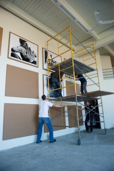
Hanging the Seattle100
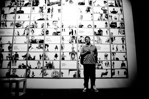
Chase in front of the book spreads
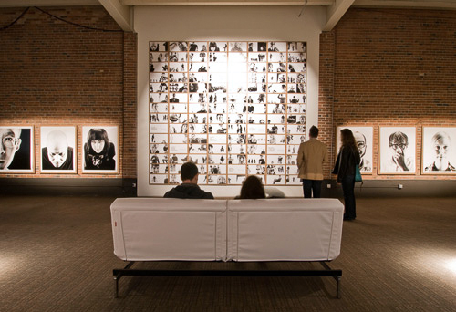
Final Walk Thru Before We Opened the Doors
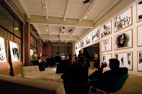
Seattle100 Opening Night 2
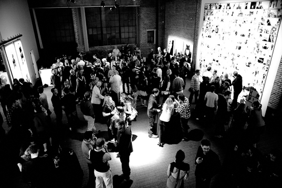
Seattle100 Opening Night 3





That looks like it was an awesome exhibition. I also share your choice of paper given the scale of the project and the fact that you needed a strong paper. Ultra Premium Luster is my paper of choice.
Looks pretty cool. Any more information/pictures about the mounting?
Thank you so much for sharing! Looked phenomenal:)
Great post Dartanyon – thanks.
We have been using Epson printers for the last six years and love them – currently running the baby brother to yours, the 7900. Agree on the paper choice too – we’ve also been getting great results for similar requirements from Ilford’s ‘Galerie Smooth Pearl’… I accidentally printed some B&W’s on this paper with the matte black ink set and produced some very ‘interesting’ results.
Cheers,
Simon
Thanks for going through the decision process! It’s very helpful – especially when you don’t have a staff of experts to help out. ‘-)
I was able to view the show and thought the exhibit was gorgeous. It really drew the viewer into it. Also loved the video on iPad you guys had set up.