It’s fair to say that a number of Chase’s images have earned the title of iconic. The images that fall into this designation generate a fair bit of discussion within our community. How was it done, where is the location, what were the camera settings, etc. A few of these iconic images have seen just enough time at my desk to make the post production a topic of conversation.
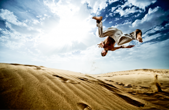
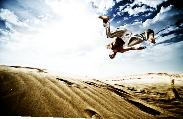
As I am able, I enjoy sharing the techniques that were used to create a certain effect and do so in response to questions that come my way via comments, posts, and emails. In the last couple of years I have found myself time and again sharing the steps that went into creating the unique look in the highly visible “sand jumper” image. Since there is so much interest in this image, and since the techniques applied are so universally useful, I thought it would be fun to pen a quick blog post giving the breakdown of the post production.
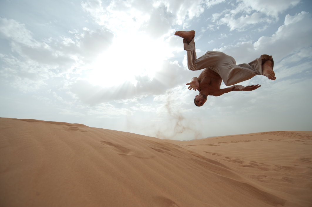
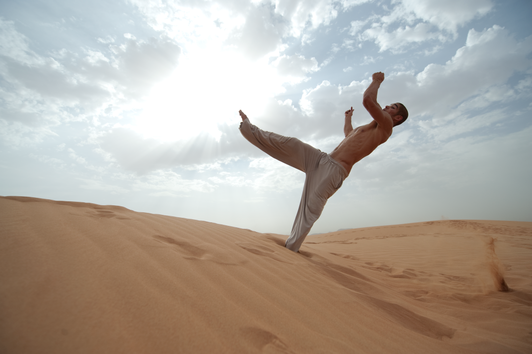
Here are the RAW files straight out of the camera. Two things worth paying attention to. First, the images are very low contrast, especially for a backlit shot. This is the result of a 5AM start, a soft haze that diffused the sunlight, and the reflective properties of sand which did a good job of bouncing some light back up on to the subject. The net result is that there is a great deal of information to work with in these files. Second, the finished file contains elements from both of these images. This brings us to the next step. We selected both a primary image based on the position of the model, and a sister image that was framed a bit wider to the right and included a sand explosion that Chase and I agreed gave some additional reference and sense of movement to the image.
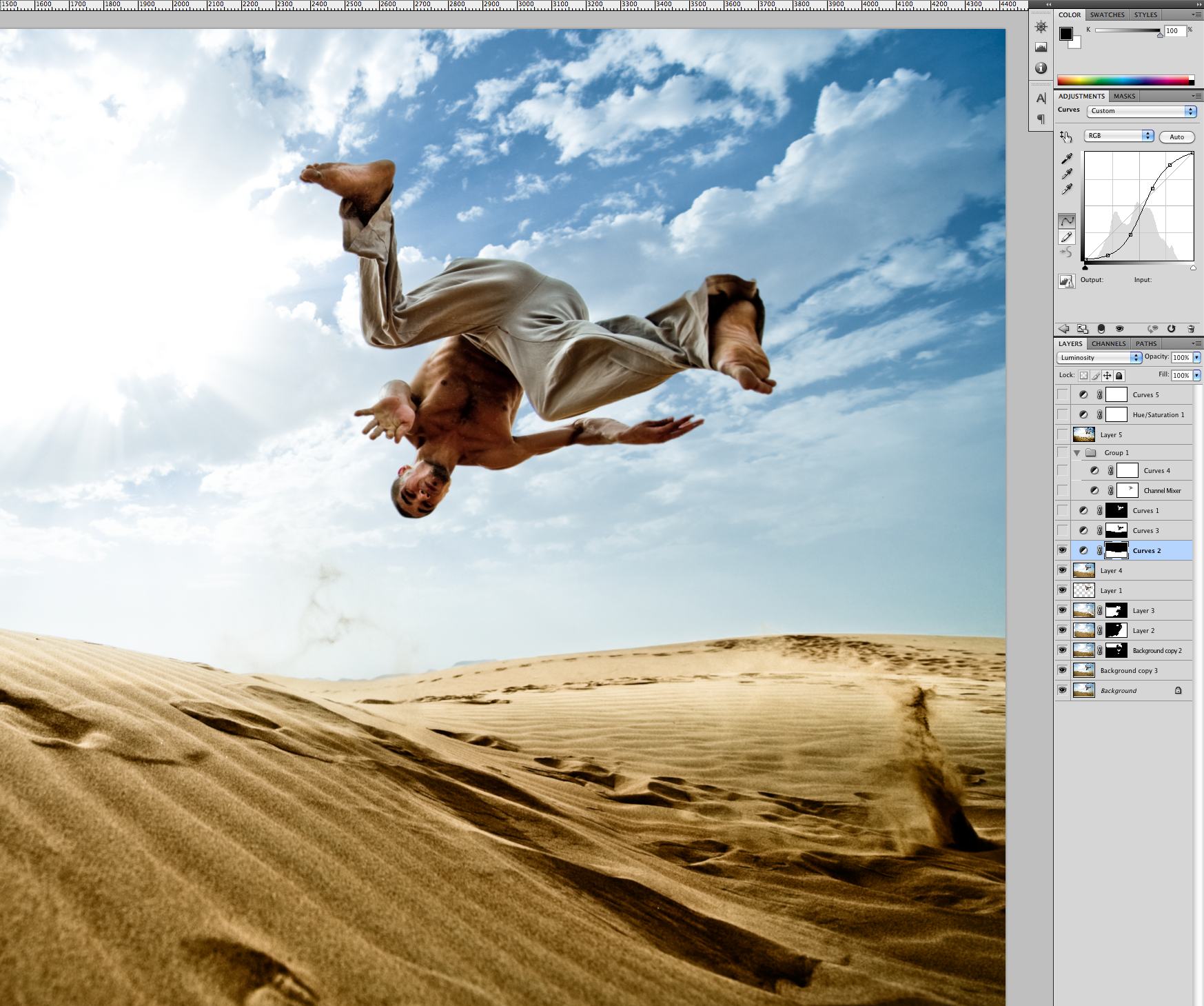
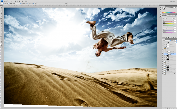
The image as you’re seeing it now represents the combined files with their initial RAW adjustments from Aperture: white balance, darkening of the shadow and midtone values, increased saturation, increased definition, and a broad vignette. The two files were combined using the Edit>Auto Align Layers command in Photoshop resulting in this image which would be further tweaked to become the final file.
Now we get into the part of the process that gives the finished image a unique, eye catching look. I often find it very productive to break down an image into distinct sections that can be evaluated and treated individually. Our aesthetic generally calls for very rich colors and accentuated textures. That is the end goal for this image, however if you were to try to apply the same level of treatment to the sand, the sky and the model, you would find that one or more of these elements would suffer for the benefit of the others. To solve this problem, we make a selection of each of these three elements so that they can each receive a separate custom treatment.
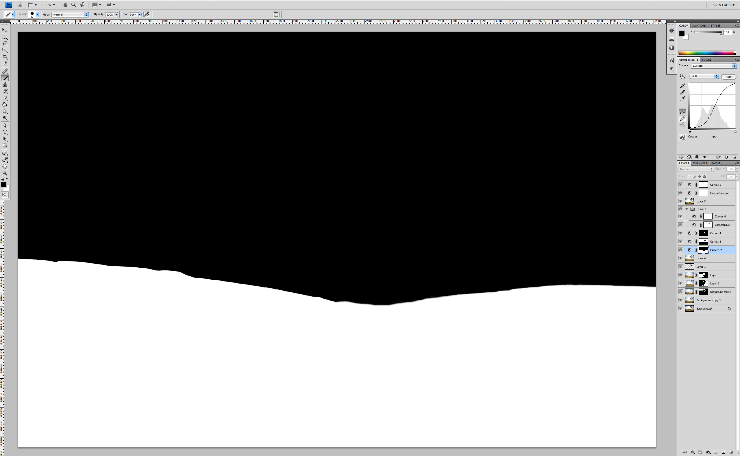
First, the sand is adjusted with a curves layer that masks out the rest of the image. The curve is a standard contrast enhancing s-curve where the darks are made darker, and the lights are made lighter.
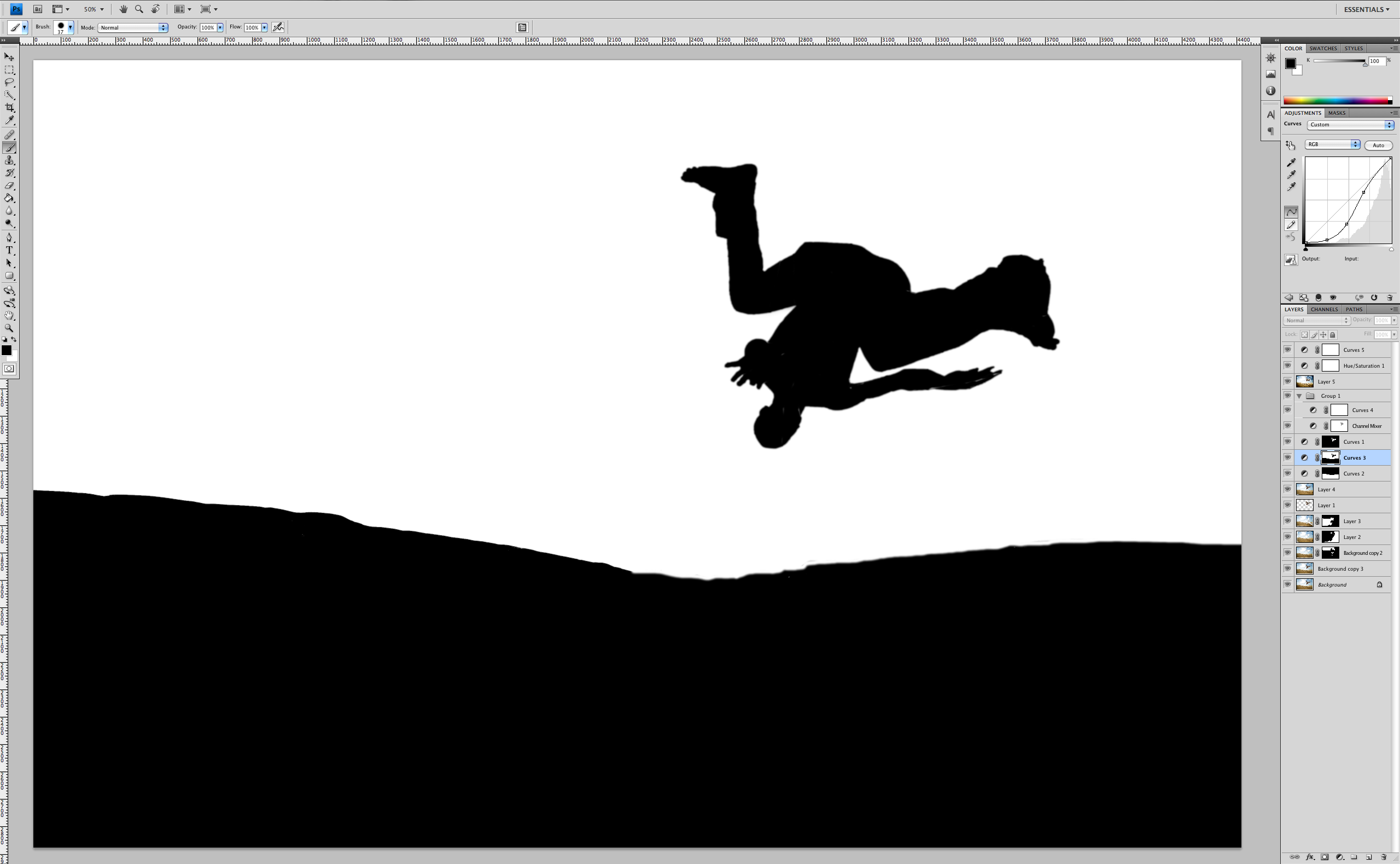
Next the sky gets the same treatment, a masked curves layer. This one however is a darkening curve, where the values are all brought down to bring out the rich tones in the sky.
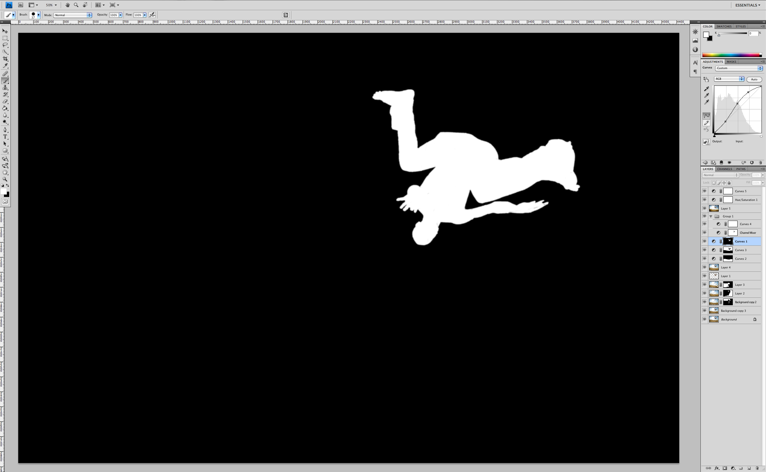
And last but certainly not least, the model gets his own masked curve adjustment, which is almost an exact opposite of the adjustment given to the sky. The result is that the midtones and highlights on the model are brightened and accentuated.
A quick note on making the masks. There are about ten thousand ways to make selections in Photoshop. There’s the magic wand, the quick selection tool, the pen tool, quick mask mode, masking with a black brush, isolating a selection with individual channels, using one of the myriad of third party plug ins, the list goes on and on. Play with all of these tools, but be very critical of the results because a poor selection can instantly ruin the illusion you’re trying to create. And, don’t be afraid of doing it by hand, the old fashioned way. Almost fell right over the nerd edge there.
OK, so we have the three elements of the image balanced and enhanced. Looks pretty good. Now a little signature spice and we’re there. My very favorite way to add punch is to use a Channel Mixer layer set to overlay mode. Let me break this down a little bit.
The overlay mode makes the darks darker and the lights lighter. Any layer you create can be put in overlay mode and it will serve to enhance the contrast. The beauty of using the Channel Mixer as your overlay layer is that you can decide what channels you want to apply the overlay to, which in simple terms gives you a great deal of control of how and where you’re adding contrast.
To illustrate, here is the image with two different Channel Mixer settings being used as an overlay, both at 100% opacity. The image on the left has the Channel Mixer set to “black and white with blue filter”. The image on the right has the Channel Mixer set to “black and white with red filter”. You can see that the image on the right with the red filter adds nice contrast but does a better job of preserving the values in the sand and the model’s skin.
Both treatments are a bit heavy, so I’ve toned the opacity down to 30% in the final file, which is the second important part of this overlay trick. By playing with the different color channels and the opacity of they Channel Mixer layer, you can get some very cool, super fine tuned results.
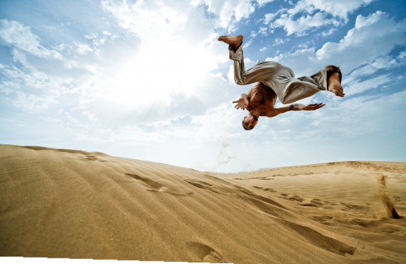
There are now just a couple of finishing touches. If you’ve been paying close attention you might have noticed that the image has not been exactly rectangular ever since the two images were combined in the early part of the process. There were two possible solutions to this, one would be to crop and the other is to stretch the image. We opted for the stretch in the lower left corner in order to keep as open a feel as possible. This was done with Filter>Distort>Lens Correction. This was followed with a very small increase in saturation and a gentle darkening of the midtones in curves.
That’s the whole story. You may have taken note of the fact that I haven’t shared the exact values of the adjustments. This is not because I don’t want you to have the secret recipe. It’s because they’re actually irrelevant. Each image is an individual and should be treated as such. What’s important is that conceptually you understand the idea of isolating elements in your images to do custom treatment, and that you get excited about some different sorts of polish you can add to your images. Photoshop is an incredible program and more than anything it gives you infinite options to create art. Keep an open mind and have fun!
If you have thoughts or would like some clarification, drop a comment at the bottom of this post and I’ll do my best to keep the conversation going. Thanks for taking the time.
Cheers!
Scott Rinckenberger










Hi Scott,
Great post.
What process did you use to mask the subject, foreground, background etc? the masking is so clean and crisp.
thanks
Tom
Hi Tom,
Since the shape of this mask and the focus were clean and sharp, I actually just drew the mask by hand. I find that this can be faster than using a masking tool and then going back and doing a bunch of clean up work. Since the edge of a mask often varies in “hardness”, working with a Wacom tablet and paying close attention to the hardness of one’s brush, you can get almost perfect results.
Nice work Scott you should do more guest blogs this one was a great read.
Cheers
Darren Tierney
Amazing! Beautiful photo and technique!
Thanks for sharing!