Whoa. Again, love how opinionated we all are. Over 1000 opinions in 18 hours. Love love it. If you happened to miss yesterday’s post, we asked for your help in choosing between two images during an edit. And, just as in previous A vs. B posts, I promised to follow up with MY preference of images and a discussion about the comparison. So here are my thoughts….(hit ‘continue reading’)
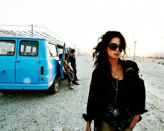
1. Resoundingly, the majority of you preferred image B. Far and away. Key components you cited were composition and mood.
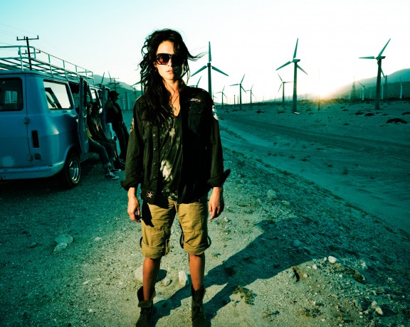
2. Those that preferred A, generally preferrerd the lighting, the color and the arresting nature of the “hot” model.
3. My preference was also for image B.
4. But I lost a $1 gentlemen’s bet to Erik here in the studio because I thought you’d prefer A since it used a flash.
5. I’m glad I was wrong about #4.
Let’s review. If I was to attempt to categorize all the feedback into some very basic, digestible bites (a tall order, but stay with me here…), it would be this: there are generally two paths for likable photographs…images that arrest us and images that welcome us, that are approachable. Sure there are subtleties to each image above–and every image–butthis A vs. B is a classic matchup of these two principles. In fact, it’s one of the reasons we chose these two images for our internal comparo–and to subsequently pitched it to you to help us figure it out.
Now let’s take another glance at the images and see what’s going on here…
This is image A, below:

In this image (A, above). She’s strobed. Intentionally harsh. Arresting. The background is underexposed a stop or two. There’s drama with light, heavy color treatment, drama with the pose…confrontation. There’s tension in the composition. She’s not where we want her in the frame…she’s overlapping with the background people, she’s off the left as opposed to balanced on the right, she’s cropped. Most of this tension is on purpose in-camera and we generally exaggerated this tension with the evocative color palette and heavy contrast. She’s locked in a gaze with you, the viewer. This is an image that is meant to arrest you. Stop you. Make you look more.
In truth, why I bet Erik a buck that this would be your favorite, was because of the light. This is a broad generalization, but I’ve become a bit jaded that the internet likes strobes because they’re gadgets (and the internet likes gadgets), but NOT because the light is of a good quality. I was happy to be wrong here.
For those that chose A as the preferred – it was usually for, what i would consider, all the “right” reasons – color and tension. So kudos for not getting sucked into the internet–lighting for the sake of lighting–fray. I was happy to be wrong.
This is image B, below:

For the above image, B, everything is naturally lit. Ambient light, 5 o’clock. Over-exposed for softness and then contrast added to bring the subject back from faded. Compositionally speaking, this is nice. Balanced. The van and people in the background on the left and the talent, Lindsey, is on gently tucked slight to the right. Classic rule of thirds here. (cut the picture in thirds, top to bottom and left to right…you’ll find most of the “stuff” stacked right on those lines…). Her expression? For one, it’s casual. Approachable. She’s human. Still beautiful. Interesting I think. It’s got more of a snapshot feel, a slice of real life. She’s walking. The tones are warm. Even the blue van has a bunch of yellow in it to warm it up. The natural back light sets her off the background a little. Warms you. Generally speaking, and certainly compared to the other image A, this is welcoming and approachable. While I enjoy artificial light, I’m generally put off by lighting for lighting’s sake. This photograph is not concerned with that. This is a photograph that I like taking at this point in my career. One that feels like a slice of life.
So there you have it. I lose a buck, but am happy to do so. We have a bunch of great discussion–internally and out here on the internet–and hopefully we all took something away. Even if it’s as simple as reminding ourselves that there’s a million ways to shoot a photo, and at least that many opinions about image preferences, but that in the end, we’re usually either trying to make a picture that arrests the viewer or one that invites them in. In either case, if the image is successful, you’ll take a closer look.


One of the tests I’ve used for judging photos is “would I like to be in the photo?” And photo B passes this test: I’d love to meet the woman and go for a ride with the guys in the van.
In photo A, she looks like she’d like to kick my ass. Now, I’ll agree that I need a good ass kicking from time to time …
I dislike two things about photo A. First, the model has no pose. It’s like you told her where to stand but didn’t give her anything to do. This bothers me about a lot of modern fashion photography too. “Pretend you’re a mannequin!”
Second, the lighting lacks motivation. Where’s this bright flash coming from? Oh, right, it’s coming from a bright flash. The lighting fails to fit the story.
The cropping in B leaves something to be desired, her missing hands leaves me wanting to scroll the image down. The area around the subject (the girl) is so bright and dominating that it’s making hard on the eyes to focus on your subject in the foreground. Photo A, although cliche’ish with the hard light and shadow, does a better job of grabbing me and locks my eyes on the subject instead of making me want to look away.
Dang, too late to vote. But I’ll vote for B, too, anyway. Hands dangling limply by side is rarely a good pose. She’s just standing there. B, on the other hand, has some movement, some attitude, some interest. Without these, no one even gets to the lighting part.
I completely forgot to vote yesterday, but I certainly liked B better as well. So fun to see what people think!