Chase Jarvis Chase Jarvis
  • Photos
  • Projects
  • About
  • Blog
  • Book
Chase Jarvis Chase Jarvis
  • Photos
  • Projects
  • About
  • Blog
  • Book

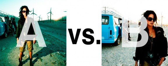
Which Photo is Better: A or B?

—

reads

  • Total: 207
  • Facebook169
  • Twitter35
  • Pinterest3
  • Buffer0

Alrighty. Regardless of the fact that this A or B series (here, here, and here) has been really interesting for us, helpful, and popular with you (the last such post received over 1000 comments in 24 hours)…

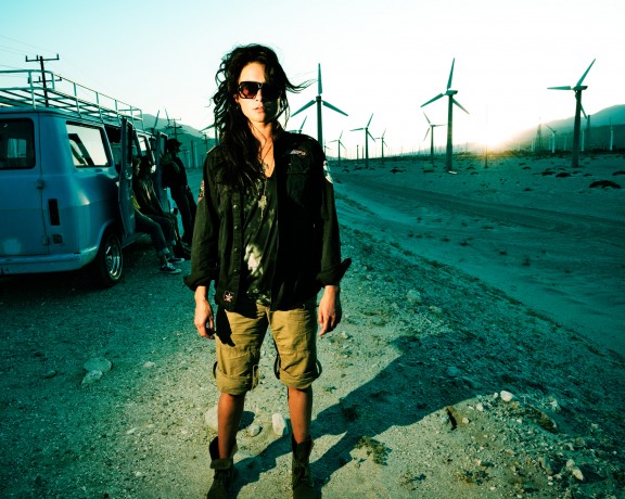
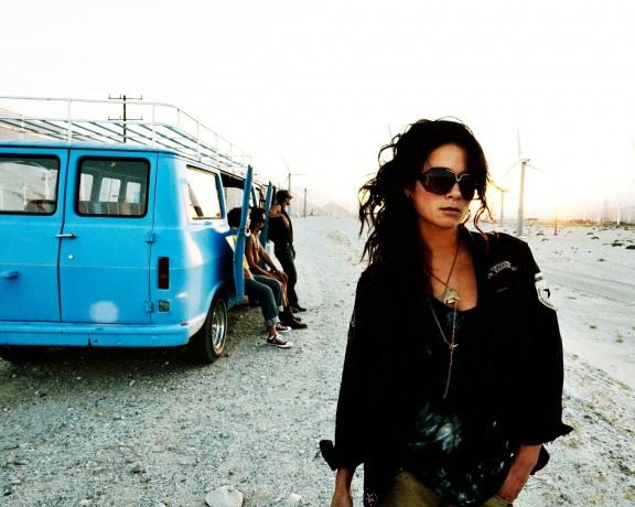
This time it is of even greater interest for us. You see, we’re doing some image editing around here and we’ve stumbled into a little internal debate about which one of these two images is actually better, A or B. [You might remember these shots from the Nikon D7000 campaign…]

Hearing from you will help really help us. No qualifiers, don’t worry about our objectives, or the “assignment”. We want to know which one of these shots you like better. And please tell us in the comments below, not via twitter. Raw preference. Period. If you can add some “why”, that would be nice too. Full 600 pixel wide images after the jump. Hit ‘continue reading’ below [and btw, I’ve got a $1 gentlemen’s bet riding with Erik about which one will win, so don’t let me down!]…

After you all weigh in, I’ll tell you which one I like, which one I thought you’d like, and why.

This is image A, below:
This is image B, below:
So which photo is better? A or B?

Related Posts

10 Things Every Creative Person (That’s YOU) Must Learn
051026_ChaseJarvis_einstein_writing_vlrgwidec
Writing Makes Photographers More Creative — 5 Easy Tips
Daniel Pink: The Power of Regret
Chris Hutchins of Chase Jarvis LIVE
Chris Hutchins: All the Hacks to Maximize Your Life
Chris Burkard on Chase Jarvis LIVE
The Wayward Path of Photographer Chris Burkard
Make Your Message Heard with Victoria Wellman

1,204 replies on:
Which Photo is Better: A or B?

Comments navigation

Next
  1. James O. says:
    February 15, 2011 at 10:03 am

    B

  2. Jun Belen says:
    February 15, 2011 at 10:03 am

    B

  3. taskans says:
    February 15, 2011 at 10:03 am

    B

  4. Danny B. says:
    February 15, 2011 at 10:00 am

    B

  5. Georg Aamodt says:
    February 15, 2011 at 9:56 am

    B 😉

    1. Anonymous says:
      February 15, 2011 at 10:13 am

      I like the color in A, but there is nothing natural about the position.

      1. Marc Goldring says:
        February 16, 2011 at 7:46 am

        B

    2. manoj bharti says:
      February 15, 2011 at 10:16 am

      {a} its more engaging then b.

      1. Mellina says:
        February 15, 2011 at 10:21 am

        A, because there’s so many conflicting ideas depicted; the environment, beauty, individuality, space, freedom…B is all about the girl.

        1. Josh says:
          February 15, 2011 at 10:29 am

          B because its all about the girl

    3. seanc says:
      February 15, 2011 at 10:47 am

      B.

      It says ‘go ahead and watch those turbines, boys. I am out of here.’

      A. looks forced

      1. spaceman spiff says:
        February 15, 2011 at 10:59 am

        in A, she’s just standing there.
        in B, she’s in a photo.

      2. Tom Weishaar says:
        August 4, 2011 at 10:36 am

        I believe B is more engaging. It has motion where A is static. B begs you to figure out what just happened. Did the boys give up expecting someone to stop by with gas for the van. Has the woman decided she’s had enough of these idiots and is brave enough or pissed off enough to just walk away. Is she the hero?

    4. D. Travis North says:
      February 15, 2011 at 12:15 pm

      B is the best. Aside from the model’s pose (which many have commented about), I think B features a better composition and certainly a more preferred lighting. The lighting in ‘B’ has more natural lighting (in appearance) and evokes more emotion and gets you to focus more on the subject. In ‘A’, it’s clearly unnatural light which is distracting, and the shadows are much too hard.

      1. Scott says:
        February 15, 2011 at 1:11 pm

        B, A looks too fake and strange

      2. David says:
        February 15, 2011 at 7:33 pm

        I prefer B. It seems more candid. A seems forced. I also prefer the composition of B. The model’s legs, while nice, do not add anything to the photo in A

    5. PJ says:
      February 15, 2011 at 12:46 pm

      I vote for B

    6. joeyg_ says:
      February 15, 2011 at 1:07 pm

      B is definately better simply because it has a sense of movement to it and i feel like something is actually going on whereas A she is just standing there

    7. Rusty Tripod says:
      February 15, 2011 at 1:10 pm

      B is much more engaging. She seems to static and disconnected from the rest in A.

    8. Eivind Sunberg says:
      February 15, 2011 at 1:10 pm

      In my opinion the best image is A. It is the best picture because it has far more components to it.
      The B picture is much more clean with less details, it dosent have that: “Okay someone has done something special here” to it. Therefor A has that X factor to it and i like it! 😀

    9. Broech says:
      February 15, 2011 at 1:33 pm

      B!! Looks like the viewer is part of the story. I also like the colour of the van in contrast to the white sand and sky. The pose of the girl is natuaral and much better then the pose in pic A

    10. gabrielle charette says:
      February 15, 2011 at 3:25 pm

      I prefer B. The image is brighter-more colorful-the subject(lindsey is naturally part of the photo)-the composition is better-my eye moves around. I like the blown-out background, pushes the image forward. Blue on the van pops in the background. Overall a better image.

    11. Glenn says:
      February 15, 2011 at 9:08 pm

      Neither one is great but B is less worse than A.

    12. Velarian says:
      February 15, 2011 at 11:29 pm

      B for its simplicity. Speaks more volume. B seems amateur like and generic where every tom dick and harry with a camera can have shot like it.

      1. Velarian says:
        February 15, 2011 at 11:31 pm

        I meant ‘A’ seems amateur like and generic where every tom dick and harry with a camera can have shots like it. B is engaged in the photo. Definitely B.

    13. juno says:
      February 16, 2011 at 12:02 am

      B is subtle

    14. Anonymous says:
      February 16, 2011 at 7:58 am

      b.

    15. Ann says:
      February 16, 2011 at 4:19 pm

      A. Love the color!

Comments navigation

Next

Comments are closed.

BUY NEVER PLAY IT SAFE NOW!

Get weekly, curated access to the best of everything I do.

Popular Posts

The show's logo is displayed on the left side, with "THE CHASE JARVIS LIVE" in bold black text inside yellow rectangles, stacked vertically. The right side of the image features a robotic figure, resembling a humanoid robot, meticulously working on a canvas. The robot is painting or drawing a grayscale portrait of a human-like figure. The robot's detailed mechanical components are visible, and the scene evokes themes of artificial intelligence, creativity, and technology. The background is minimal, allowing focus on the robot and its artwork. The composition suggests an exploration of AI's role in creative processes.Is AI the End of Creativity or Just the Beginning?
20240607_CJLIVE_PayYourselfFirst_Micro_16x9-webSigns You’re Putting Yourself Last (+ How to Fix It)
20241111_CJLIVE_MarthaBeck_Thumb_16x9_v2.5Curiosity, Creativity, and Purpose: Can They Really Defeat Anxiety?
Image of Arthur Brooks with the text "Is This True Happiness?" overlayed. The background features a dynamic arrangement of falling dollar bills and coins. In the top left corner, the logo of "The Chase Jarvis Live Show" is visible, framed in a bright yellow box. Arthur Brooks is positioned on the right side, wearing glasses and a suit, looking directly at the camera with a slight smile. The overall design is intended to provoke thoughts on the relationship between money and happiness.Arthur Brooks: The (Real) Reason You’re Not Happy
A person standing on a rocky outcrop, surrounded by dense evergreen forest. In the background, there are snow-capped mountains under a cloudy sky. Overlaid on the image, on the left side, there is text in bold yellow and black that reads: "THE CHASE JARVIS LIVE SHOW". The text is stacked with "THE" on top, followed by "CHASE JARVIS", and then "LIVE SHOW" at the bottom.Silent Saboteur: Why You Keep Breaking Your Own Promises
Dr. Tessa West and a title "This Is Why Connections Matter." Dr. Tessa West is positioned on the left side, smiling and wearing a burgundy top. The background has a dotted pattern with a gradient from black to blue. The title is prominently displayed in bold white and yellow text, with the word "Connections" highlighted in yellow. In the top right corner, there is a small logo for "The Chase Jarvis LIVE Show."Finding Meaningful Work is Harder Than You Think
On the left side, the show's logo is prominently displayed, with "THE CHASE JARVIS LIVE SHOW" in bold black text inside yellow rectangles, stacked vertically. To the right of the logo, the image depicts a dark, moody scene inside a room at night. A wooden table is at the center, on which a laptop is placed. The laptop is on fire, with flames engulfing the screen and keyboard, casting a warm glow on the surrounding area. The room has large windows with potted plants on the windowsill, and there is a radiator beneath the window. The lighting in the room contrasts with the fire's bright, intense glow, creating a dramatic effect.Hustle Culture: The Silent Killer of Ambition
On the left side, the show's logo is placed in the top left corner, featuring "THE CHASE JARVIS LIVE SHOW" in black text within yellow rectangles. Below the logo, the text reads: "PRACTICE COLLECTIVE HEALING" The words "PRACTICE" and "HEALING" are in bold white font, while "COLLECTIVE" is in bold yellow font. The text is set against a dark gray background. On the right side of the image, there is a photo of a person with medium-length dreadlocks, wearing a blue shirt, and looking directly at the camera with a serious expression. The image has a yellow border around it, which complements the overall color scheme of the graphic.What Happens When You Add Mindful Moments to Your Day?
Chase Jarvis in mid-conversation, gesturing with his hands, wearing a casual maroon t-shirt. The background appears to be an indoor space with wooden beams on the ceiling and soft lighting. On the left side, a bold yellow and black graphic reads "THE CHASE JARVIS LIVE SHOW," with each word stacked in a column. The scene conveys an energetic and engaging atmosphere, with Chase passionately explaining something to the person in front of him.The Secret to Lifelong Creativity (Hint: It Doesn’t End After Your 20s)
Rewatch the 5.5 Hour Never Play It Safe Book Launch Event

Daily Creative Projects

© 2024 Chase Jarvis. All rights reserved.

My New Book Is Here!

This book is a powerful compass for embracing risk and creativity in all aspects of life. Chase shows us how to step out of our comfort zones and become who we were meant to be.

SOPHIA AMORUSO
Serial Entreprenuer
NYT Best Selling Author of Girlboss

BUY NOW!

My New Book Is Here!

This book is a powerful compass for embracing risk and creativity in all aspects of life. Chase shows us how to step out of our comfort zones and become who we were meant to be.

SOPHIA AMORUSO
Serial Entreprenuer
NYT Best Selling Author of Girlboss

BUY NOW!