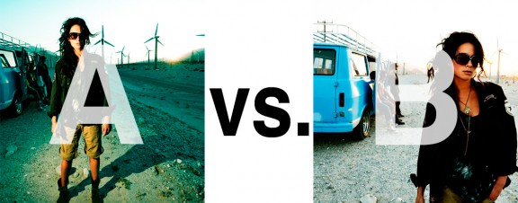
Alrighty. Regardless of the fact that this A or B series (here, here, and here) has been really interesting for us, helpful, and popular with you (the last such post received over 1000 comments in 24 hours)…
This time it is of even greater interest for us. You see, we’re doing some image editing around here and we’ve stumbled into a little internal debate about which one of these two images is actually better, A or B. [You might remember these shots from the Nikon D7000 campaign…]
Hearing from you will help really help us. No qualifiers, don’t worry about our objectives, or the “assignment”. We want to know which one of these shots you like better. And please tell us in the comments below, not via twitter. Raw preference. Period. If you can add some “why”, that would be nice too. Full 600 pixel wide images after the jump. Hit ‘continue reading’ below [and btw, I’ve got a $1 gentlemen’s bet riding with Erik about which one will win, so don’t let me down!]…
After you all weigh in, I’ll tell you which one I like, which one I thought you’d like, and why.
This is image A, below:
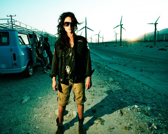
This is image B, below:
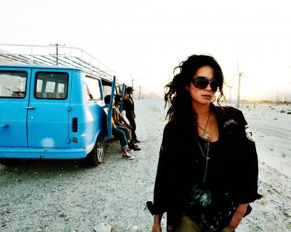
So which photo is better? A or B?






Seems like an overabundance of natural light lovers. I am going with “A”, due to the added drama provided by the artificial light, and the increased background presence.
Photo “B”, I don’t like the cropped toes in “a” so by default “B” wins.
Really hard to choose, I like both a lot. I think I’m gonna go for B though 🙂 Very nice shot. I like her pose and the overexposure on the background.
B is better…. I miss the windmills though, but the over all light and composition is better in B in my opinion.
A because it has this really nice background, where one is really able to see what she is surrounded with… in B you can barely see the background, i dont like that so much
Cheers Greg