Alrighty. Regardless of the fact that this A or B series (here, here, and here) has been really interesting for us, helpful, and popular with you (the last such post received over 1000 comments in 24 hours)…
This time it is of even greater interest for us. You see, we’re doing some image editing around here and we’ve stumbled into a little internal debate about which one of these two images is actually better, A or B. [You might remember these shots from the Nikon D7000 campaign…]
Hearing from you will help really help us. No qualifiers, don’t worry about our objectives, or the “assignment”. We want to know which one of these shots you like better. And please tell us in the comments below, not via twitter. Raw preference. Period. If you can add some “why”, that would be nice too. Full 600 pixel wide images after the jump. Hit ‘continue reading’ below [and btw, I’ve got a $1 gentlemen’s bet riding with Erik about which one will win, so don’t let me down!]…
After you all weigh in, I’ll tell you which one I like, which one I thought you’d like, and why.
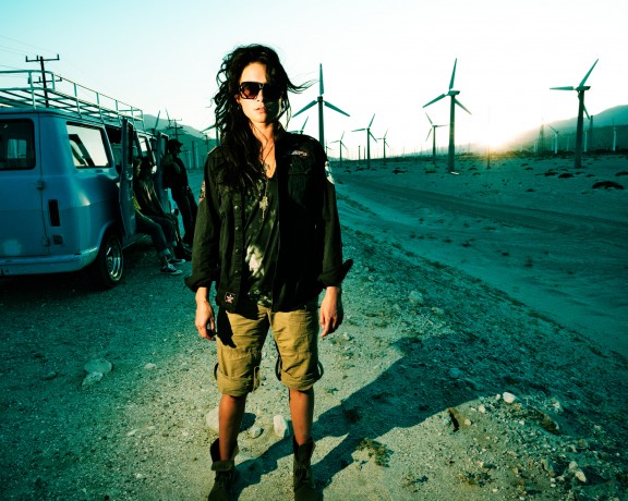
This is image A, below:
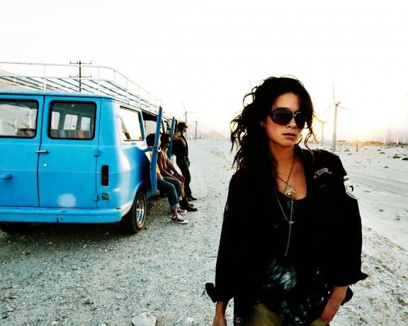
This is image B, below:
So which photo is better? A or B?






B. Its a very clean image, but still had depth and enough interesting things going on in the background 🙂
B, She is the subject rather then just the foreground. You can still get the sense of the wind farm and the other people but A is too distracting.
B for me as well. It just feels more natural.
IMHO A is unappealingly distorted. Legs are short, torso’s elongated, and she got the 5 head going on. ¿Caused by a wide from a eye level vantage point? It has that lens edge stretch thing. forgot what they call it. IMHO B is much better. I might be OC but I wish the right hand wasn’t cropped though. Left hand is funky too. I’m sure you got the shot you needed though.
B is stronger, clean, nice subject placement, a little DOF, natural feel, elements better support key subject.
In ‘A’ There is too much going on don’t know what to look at, everything is in focus and the densities are all nearly the same, my eyes are all over the place, the talent is nearly smack dab in the middle of the frame, all the supporting elements are merging with her (Van, Windmill), with no feeling of separation, the road ends at her taking away depth into the frame, and not a fan of the hard light camera left. Looks cheap, no thought went into placement, unless it was intensional to make a bad photo…. was the plan?