A while back I had Grammy Award Winner, Sir Mix-A-lot on chasejarvisLIVE. The guy is smart – dropped some pretty serious knowledge on the show [here’s the re-watch if you missed it].
At the end of the show, I shot the cover for his upcoming album, live, online. Here are the results.
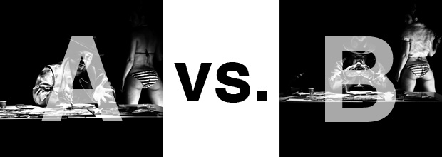
The lead one that shows his face is my fav, but there’s plenty of debate, because the other shot is tough and mysterious. I’ll resist the temptation to make any real case for one or the other, and I’ll let this is a straight up survey – which photo do you like better A (top) or B (bottom)? (please answer in the post, not via other social channels so we don’t have to chase your feedback – thx!)
Thanks for your input.
||And if you missed it: Here’s the chasejarvisLIVE episode with Mix||


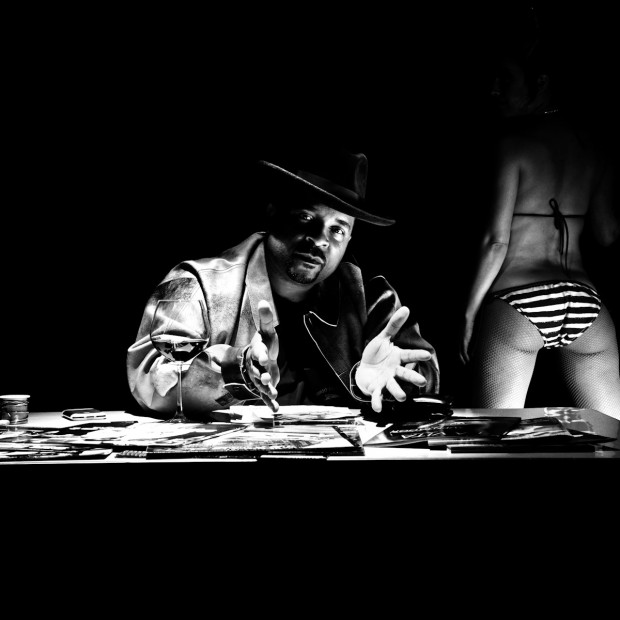
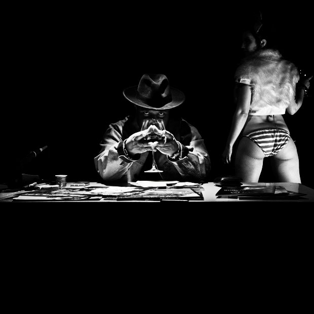






“A” has my vote. I like both but the clear visual on his face and the shirt in on the model in “B” is distracting to me.
B is cool, but I say A because you see it and immediately know who it is. It’s Mix!
Go with B. make it a much tighter crop, with Sir left of center, loose 1/3 of the girl.
A is a bit more predictable in my opinion
Both pics are cool, though
Go with B. The girl with the bootie is almost too obvious of a choice, but only almost. The lighting is more dramatic in B, and the glass, without hiding the fact that the subject of the pic is Sir Mix-a-Lot, adds drama and a more stunning element to the pic.
Absolutely undoubtedly B. Theres style, story and freshness to B. A looks so like commonplace cheap art.