Chase Jarvis Chase Jarvis
  • Photos
  • Projects
  • About
  • Blog
  • Book
Chase Jarvis Chase Jarvis
  • Photos
  • Projects
  • About
  • Blog
  • Book

Which Photo is Better A or B? [Sir Mix-A-Lot Album Cover]

A while back I had Grammy Award Winner, Sir Mix-A-lot on chasejarvisLIVE. The guy is smart – dropped some pretty serious knowledge on the show [here’s the re-watch if you missed it].

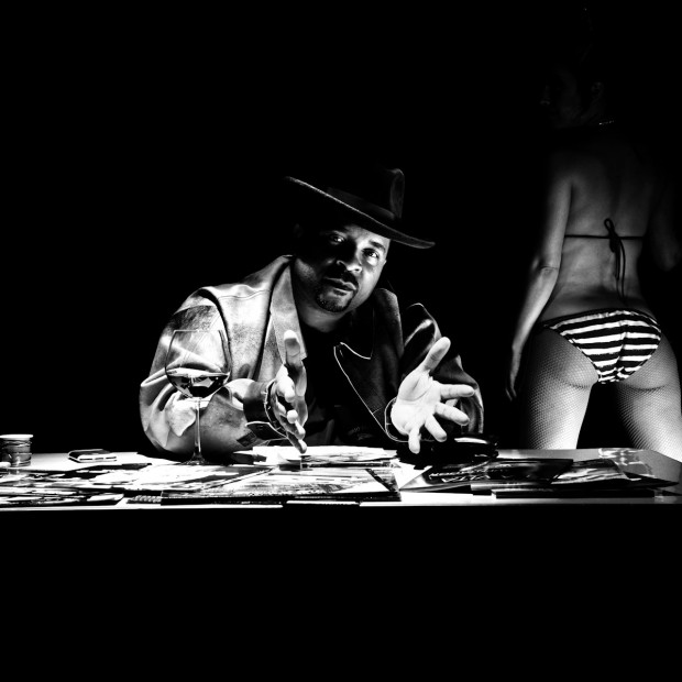
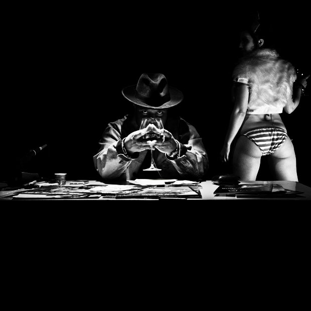
At the end of the show, I shot the cover for his upcoming album, live, online. Here are the results.

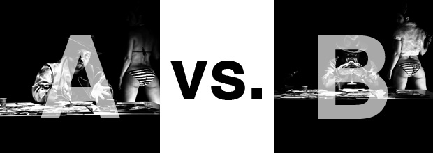
The lead one that shows his face is my fav, but there’s plenty of debate, because the other shot is tough and mysterious. I’ll resist the temptation to make any real case for one or the other, and I’ll let this is a straight up survey – which photo do you like better A (top) or B (bottom)? (please answer in the post, not via other social channels so we don’t have to chase your feedback – thx!)

Here is photo A:

Here is photo B:

So which is better??

Thanks for your input.

||And if you missed it: Here’s the chasejarvisLIVE episode with Mix||

Related Posts

10 Things Every Creative Person (That’s YOU) Must Learn
051026_ChaseJarvis_einstein_writing_vlrgwidec
Writing Makes Photographers More Creative — 5 Easy Tips
Daniel Pink: The Power of Regret
Chris Hutchins of Chase Jarvis LIVE
Chris Hutchins: All the Hacks to Maximize Your Life
Chris Burkard on Chase Jarvis LIVE
The Wayward Path of Photographer Chris Burkard
Make Your Message Heard with Victoria Wellman

743 replies on:
Which Photo is Better A or B? [Sir Mix-A-Lot Album Cover]

Comments navigation

Previous
Next
  1. Edward Artiste says:
    September 13, 2011 at 8:07 am

    (Pulls out the Art Director hat, relaxes)

    Here’s what we do. Take the foreground from A, add the background from B. The first booty shot looks like an awkward angle compared to the second.

    Hiding his face doesn’t look so hot (unless the title attributes to some sort of mystery, reasoning, etc). i would also argue that there’s a bit too much contrast going on in the other, but at least you can see him proper. I would possibly add some sort of background wall- only shown in grey- barely showing itself for atmosphere. it would even help give a slight depth to the potentially gi-normous logo that looks like will be inserted in all that black space.

    There you go. easy breezy. I can do this all day Chase! (available on weekends in NYC!)

    http://photography.ashworld.com (shameless plug)

  2. Sander says:
    September 13, 2011 at 8:07 am

    Photo B, because of the face of the girl and the mysterious look of Mix

  3. Pat says:
    September 13, 2011 at 8:07 am

    A, but crop the girl out.

  4. Pete says:
    September 13, 2011 at 8:06 am

    I’d like B cropped to just Sir Mix. (especially if the new album is harder/darker than poppy) I get that the booty identifies him as Sir Mix but it’s a bit of hanging on to the past which feels desperate. Also, the symmetry of his position mimics a booty anyway. (which I like. very subliminal/ unconscious). The pose in A feels like a moment in between…sort of confusing expression with the hands. No strength for me. Like he’s uncomfortable or unsure about this album.

  5. Nate Geslin says:
    September 13, 2011 at 8:05 am

    He looks better in A, but she looks better in B.

    But all together B is the better of the two. There is some mystery and more tension. My first impulse was A, but after looking closely at both of them B is my favorite.

Comments navigation

Previous
Next

Comments are closed.

BUY NEVER PLAY IT SAFE NOW!

Get weekly, curated access to the best of everything I do.

Popular Posts

20250916_CJLIVE_StageNotSofa_Micro_Thumb_16x9_v2.5Social Media as a Stage, Not a Sofa
20250826_CJLIVE_DontTradeDreams_Micro_Thumb_16x9_v2.5Don’t Trade Your Dreams for Security
Never Play It Safe – Q&A #1
Héctor García and Francesc Miralles smiling, with bold text in the center reading '4 Steps to Discover Your True Purpose' on a black background. Framed with a yellow border, creating a high-contrast, engaging design.Why You’re Not Finding Your Purpose
Illustration of a person standing at the edge of a high cliff, gazing out over distant mountains under an orange sky, symbolizing contemplation, choice, and risk.How ‘Playing It Safe’ Almost Cost Me Everything (Don’t Settle!)
20241030_CJLIVE_BrianSolis_Blog_16x97 Ways AI is Transforming Creativity
20250320_CJLIVE_JennyWood_Thumb_16x9_v2.5What’s Stopping You From Taking the Risk That Could Change Everything?
20250305_CJLIVE_MelissaArnotReid_Thumb_16x9_v2.5What If Your Hardest Climb Is Within?
20250327_CJLIVE_B&H_Syndicate_Thumb_16x9_v2.5How Sharing Your Work Can Change Lives Including Your Own
20250611_CJLIVE_ToDoList_Micro_Thumb_16x9_v2.5What If Social Media Was the Best Way to Learn New Creative Skills?

Daily Creative Projects

© 2024 Chase Jarvis. All rights reserved.