A while back I had Grammy Award Winner, Sir Mix-A-lot on chasejarvisLIVE. The guy is smart – dropped some pretty serious knowledge on the show [here’s the re-watch if you missed it].
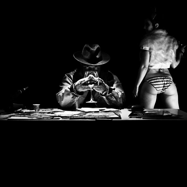
At the end of the show, I shot the cover for his upcoming album, live, online. Here are the results.
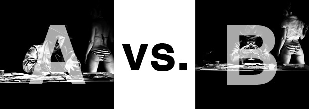
The lead one that shows his face is my fav, but there’s plenty of debate, because the other shot is tough and mysterious. I’ll resist the temptation to make any real case for one or the other, and I’ll let this is a straight up survey – which photo do you like better A (top) or B (bottom)? (please answer in the post, not via other social channels so we don’t have to chase your feedback – thx!)
Thanks for your input.
||And if you missed it: Here’s the chasejarvisLIVE episode with Mix||


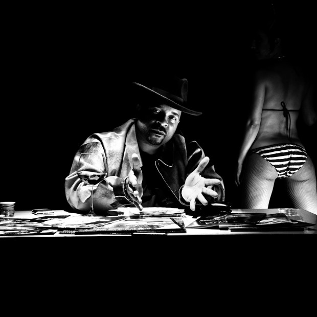





A. I think the cup is distracting from the character of Mix a Lot. The booty is perfect, by just having a glimpse of the whole woman.
B is my pic. Love the eyes, but I do like the girl in A better…. tough call!
B
I find B much more powerful and interesting. I think this is down to the dude’s pose which for me is a lot more cinematic and somehow asks a question. I also like the way it leads the eyes to his and to the upside down heart shape that his hands make, and then to the tiny heart shape that is made on the guys fingers with the hot spot.
If it were me I’d keep B for the dude and photoshop the girl from A (just looks better) in and consider putting a bundle of notes on the desk to the left and maybe have something in the upper left to balance the girl on the right – maybe a safe or something as simple as a clock indicating it’s the early hours…probably with a bit of smoke for effect n gangsta stylee.
Rockin shot’s tho so both are winners really 🙂
Paul
Both photos would work great of course. I like A better overall, though I like the eyes & glass of B. The bikini-clad woman is better in A than the look in B. Putting the bikini look into B might make it the final image for me.