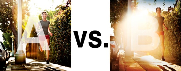
I was just recently commissioned for a campaign and shot about 1000 images to capture final image for this well known sports company. In the end, it came down to the two images above. As is usually the case, the final image is tough to choose, with lots of factors under consideration, lots of stakeholders picking their favorite. There was much debate.
I’ve posted stuff like this before and was really excited by the resulting discussion, so I figured I’d throw it out there again… WHICH IS BETTER, A or B?
Vote in the comments. Love to know ‘why’ if you care to explain your thoughts. 600 px wide versions of each image after the jump…hit [‘continue reading’ below]. After you all weigh in, I’ll tell you which one was used and why.
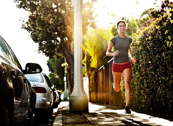
This is PHOTO A, below.
THIS is PHOTO B, below.
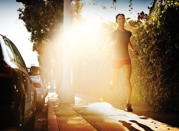








A! The flare in B is just a little too much, unless you want lots off negative space.
My choice is B. A is nice and neat but B has more oomph.
Although I like B I think the flare is just to much, and is taking away from the photo itself. But if the shot is dealing with flare and light I would say B. So not knowing I’m going with Photo A
Chase, two of my housmates say A. They think the flare is too strong. I said B earlier. ALSO, fyi.. It’d be great if you can throw the comment box at the top especially when viewing on an iPad. Otherwise one has scroll down 900 comments. Not so fun.
🙁
It really depends on the purpose and use of the photo to say which is better. Having said that, I would pick B. A seems to be the better one, but the light green in the background draws my eye away from the runner. The overexposure certainly draws my eye here and hence on the runner and her shadow.