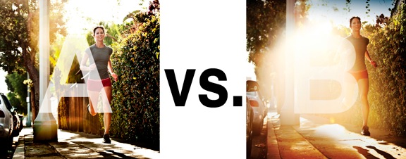
I was just recently commissioned for a campaign and shot about 1000 images to capture final image for this well known sports company. In the end, it came down to the two images above. As is usually the case, the final image is tough to choose, with lots of factors under consideration, lots of stakeholders picking their favorite. There was much debate.
I’ve posted stuff like this before and was really excited by the resulting discussion, so I figured I’d throw it out there again… WHICH IS BETTER, A or B?
Vote in the comments. Love to know ‘why’ if you care to explain your thoughts. 600 px wide versions of each image after the jump…hit [‘continue reading’ below]. After you all weigh in, I’ll tell you which one was used and why.
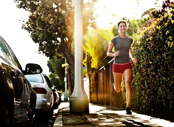
This is PHOTO A, below.

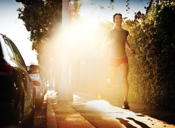
THIS is PHOTO B, below.


Most of what I feel has been said before.
A is a factual account of someone running …. there is little room for the viewer’s imagination to do anything
depending on the message to go with the image. Its a cleaner shot more technically correct shot. But these don’t always make the best advertising photos.
In B, the runner is awash with the dawn’s light, signalling a fresh new start to the day.
If you can picture yourself running, it’s in the early morning, the air has a slight chill, you feel alive, invigorated.
The sun’s first light gives you a gentle kiss, warming you up, lighting the way on the road ahead.
There are possibilities for the marketers and advertising to take this image in any number of different directions.
I’ll go for B.
Kinda surprising though that from 1000 shots these two were chosen as the best.
Me thinks there’s an interesting twist in this tale.
A for me. The purpose of the picture is to say something about sport and A does this. B is more artistic but it is unclear what the photographs is about. Is it about the sun? Seems to be as you can barely see what the woman is doing. B is almost an example of how flare/shooting into the light can dominate a picture too much so the meaning is lost. I would say A but not mad about the pole. Why is it there? What purpose does it serve? This is a planned shoot so everything in the frame must be there for a deliberate reason. Can’t see a reason for it as it dominates the picture too much and has nothing to do with sport.
A is better.
To me, B is like Sarah Corner running away from the nuke on Judgement Day. that flare is .. too much
B will be used as campaigns need text which the flair allows
Weigh in on “which photo is better” comes down to whats the intent. Also something to keep in mind is image crop and the actual size this image will be viewed. When I first saw these images on twitter I gravitated to image B. The crop and size of the image made image B more appealing and the flare made more sense. Image A didn’t had that inicial presence to bring you in and explore the image.
Ultimately I choose image A because the running action of your subject seems more proactive. The contrast of the urban setting and her running gives me the sense that she is in control of her health and body. She is taking action. Also image A is aesthetically pleasing and versatile.