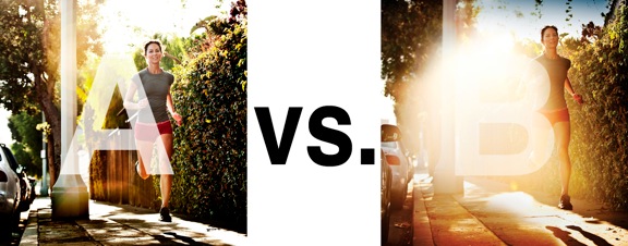
I was just recently commissioned for a campaign and shot about 1000 images to capture final image for this well known sports company. In the end, it came down to the two images above. As is usually the case, the final image is tough to choose, with lots of factors under consideration, lots of stakeholders picking their favorite. There was much debate.
I’ve posted stuff like this before and was really excited by the resulting discussion, so I figured I’d throw it out there again… WHICH IS BETTER, A or B?
Vote in the comments. Love to know ‘why’ if you care to explain your thoughts. 600 px wide versions of each image after the jump…hit [‘continue reading’ below]. After you all weigh in, I’ll tell you which one was used and why.
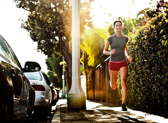
This is PHOTO A, below.

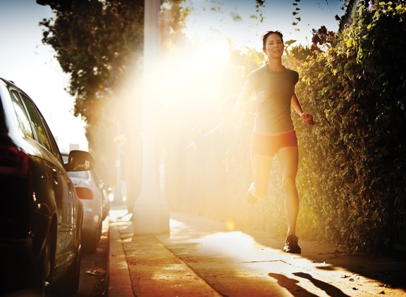
THIS is PHOTO B, below.


B. for all the reasons that were mentioned previously, and again the company will have their graphic artist place cool text within that huge flair.
I prefer A. The flare it’s too present on B, it becomes more important than the runner herself.
Not having enough information about your client makes a selection more difficult! My preference is B – not because of the flare, but because the runner is NOT looking at the camera. In A, her attention to the photographer is distracting to me, and has me looking at her face first, not her surroundings or her purpose.
B’s lighting gives off a more dramatic effect. Which can definetly work in the ads favor.
It’s not a matter which is better photographically, but which better suits the client’s needs. I would guess that B would allow more freedom for the graphic artists to use for inserting copy over image and still deliver a strong, overall impression.