Chase Jarvis Chase Jarvis
  • Photos
  • Projects
  • About
  • Blog
  • Book
Chase Jarvis Chase Jarvis
  • Photos
  • Projects
  • About
  • Blog
  • Book

Which Photo is Better: A or B?

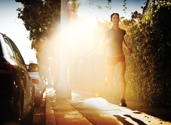
Runner.jpg

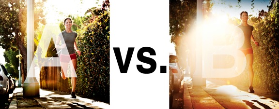
I was just recently commissioned for a campaign and shot about 1000 images to capture final image for this well known sports company. In the end, it came down to the two images above. As is usually the case, the final image is tough to choose, with lots of factors under consideration, lots of stakeholders picking their favorite. There was much debate.

I’ve posted stuff like this before and was really excited by the resulting discussion, so I figured I’d throw it out there again… WHICH IS BETTER, A or B?

Vote in the comments. Love to know ‘why’ if you care to explain your thoughts. 600 px wide versions of each image after the jump…hit [‘continue reading’ below]. After you all weigh in, I’ll tell you which one was used and why.

This is PHOTO A, below.
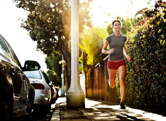
 

Runner A

THIS is PHOTO B, below.


Runner B

Related Posts

10 Things Every Creative Person (That’s YOU) Must Learn
051026_ChaseJarvis_einstein_writing_vlrgwidec
Writing Makes Photographers More Creative — 5 Easy Tips
Daniel Pink: The Power of Regret
Chris Hutchins of Chase Jarvis LIVE
Chris Hutchins: All the Hacks to Maximize Your Life
Chris Burkard on Chase Jarvis LIVE
The Wayward Path of Photographer Chris Burkard
Make Your Message Heard with Victoria Wellman

1,351 replies on:
Which Photo is Better: A or B?

Comments navigation

Previous
Next
  1. Erik says:
    July 29, 2014 at 9:13 am

    I think it depends on the layout of the ad and the ‘feel’ you want to have with the ad. Without knowing these important pieces it’s hard to pick one over the other. They’re both beautiful images for their own reasons.

  2. Jonerec says:
    July 29, 2014 at 7:44 am

    I think B, it gives more dramatic feel like, also it gives a mood about the picture.

  3. Ali says:
    July 28, 2014 at 11:52 pm

    I prefer A. The flaring in B doesn’t work for me. It takes over rather than enhances the shot

  4. Tim says:
    July 28, 2014 at 10:23 pm

    I like B. I think the lower angle is better, I like seeing more of her hard shadow. Her foot is not amputated on B and I think the flare will interrupt the viewers attention and pull them into the ad.

  5. Melody says:
    July 28, 2014 at 9:57 pm

    I personally prefer B. I love flare and am attracted to it. However, for a marketing campaign I’d have to vote A. Purely for logistic reasons.

Comments navigation

Previous
Next

Comments are closed.

BUY NEVER PLAY IT SAFE NOW!

Get weekly, curated access to the best of everything I do.

Popular Posts

meta ai dockMeta AI: Is it the “free Midjourney”? My in-depth review for creative pros.
Richard Branson on Chase Jarvis LIVERichard Branson’s “Screw It, Just Do It” Guide to Launching Your Big Idea
20241001_CJLIVE_GaryVeeShow_Syndicate_Blog_16x9How Self-Betrayal Is Holding You Back
20241219_CJLIVE_AaronLeventhal_Thumb_16x9_v2.5Beyond Midlife: How Can ‘The New Fit’ Guide Your Health Journey?
20251013_CJLIVE_PortfolioTrap_Micro_Thumb_16x9_v2.5Stop Curating. Start Creating.
nano banana deskNano Banana (Google Gemini) 101 for Photographers
a portrait of Seth Godin, a bald man wearing yellow glasses and a blue suit with a yellow and blue striped tie. The background is predominantly black with a checkered pattern (black and white squares) along the right edge, creating a chessboard effect. The text reads "CHECKMATE STRATEGY WINS" in bold white capital letters, positioned to the left of the image. The thumbnail has a yellow border, and in the top right corner, there is a small yellow logo that says "THE CHASE JARVIS LIVE SHOW.Seth Godin’s Guide to Doing Work That Genuinely Matters

Daily Creative Projects

© 2024 Chase Jarvis. All rights reserved.