Chase Jarvis Chase Jarvis
  • Photos
  • Projects
  • About
  • Blog
  • Book
Chase Jarvis Chase Jarvis
  • Photos
  • Projects
  • About
  • Blog
  • Book

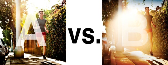
Which Photo is Better: A or B?

Runner.jpg

I was just recently commissioned for a campaign and shot about 1000 images to capture final image for this well known sports company. In the end, it came down to the two images above. As is usually the case, the final image is tough to choose, with lots of factors under consideration, lots of stakeholders picking their favorite. There was much debate.

I’ve posted stuff like this before and was really excited by the resulting discussion, so I figured I’d throw it out there again… WHICH IS BETTER, A or B?

Vote in the comments. Love to know ‘why’ if you care to explain your thoughts. 600 px wide versions of each image after the jump…hit [‘continue reading’ below]. After you all weigh in, I’ll tell you which one was used and why.

This is PHOTO A, below.
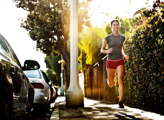
 

Runner A

THIS is PHOTO B, below.


Runner B

Related Posts

10 Things Every Creative Person (That’s YOU) Must Learn
051026_ChaseJarvis_einstein_writing_vlrgwidec
Writing Makes Photographers More Creative — 5 Easy Tips
Daniel Pink: The Power of Regret
Chris Hutchins of Chase Jarvis LIVE
Chris Hutchins: All the Hacks to Maximize Your Life
Chris Burkard on Chase Jarvis LIVE
The Wayward Path of Photographer Chris Burkard
Make Your Message Heard with Victoria Wellman

1,351 replies on:
Which Photo is Better: A or B?

Comments navigation

Previous
Next
  1. Frush says:
    September 1, 2014 at 1:28 pm

    If you are going for finest contents like me, just go to see this web site daily because it presents feature contents, thanks

  2. Ivonne says:
    August 4, 2014 at 4:23 pm

    photo B looks better to me because the light makes her look empowering

  3. Gallant says:
    July 29, 2014 at 9:43 pm

    It really depends on the usage.

    If I could only choose one I would choose A over B. But otherwise I would make a composite.

    Both are solid images, interesting composition. I have no issue with the lens flare- I always ask myself, does it add anything to the image? in this instance I would say it doesn’t add anything on top of A. In A there is already a hint of lens flare, the colours are rich and warm in both instilling the same sense of time, weather, and mood. The only advantage of the lens flare is it ‘softens’ the distraction that is the white telegraph/power pole.

    However, A wins because of this one thing for me:
    it’s more engaging. The expression on the runner’s face, her gate all come together.

    Again it really depends on the brief and how/where this image would be used.
    Image B would be great if it’s designed to set the mood… with accompanying copy.

    Have we got a response as to which was chosen yet?

  4. chris says:
    July 29, 2014 at 2:43 pm

    A – looks clean, might crop a bit closer

  5. art meripol says:
    July 29, 2014 at 12:14 pm

    It’s B for me. the post and cars all distract from the runner. But here eyes and expression are immediate with the flair obscuring and focusing the viewer on her, her energy and life. Too esoteric? sorry but I see it that way.

Comments navigation

Previous
Next

Comments are closed.

BUY NEVER PLAY IT SAFE NOW!

Get weekly, curated access to the best of everything I do.

Popular Posts

meta ai dockMeta AI: Is it the “free Midjourney”? My in-depth review for creative pros.
Richard Branson on Chase Jarvis LIVERichard Branson’s “Screw It, Just Do It” Guide to Launching Your Big Idea
20241219_CJLIVE_AaronLeventhal_Thumb_16x9_v2.5Beyond Midlife: How Can ‘The New Fit’ Guide Your Health Journey?
20251013_CJLIVE_PortfolioTrap_Micro_Thumb_16x9_v2.5Stop Curating. Start Creating.
20241001_CJLIVE_GaryVeeShow_Syndicate_Blog_16x9How Self-Betrayal Is Holding You Back
nano banana deskNano Banana (Google Gemini) 101 for Photographers
affinity_vector_poster_urlAffinity Studio vs Adobe Creative Cloud for creative pros: It just got real
a portrait of Seth Godin, a bald man wearing yellow glasses and a blue suit with a yellow and blue striped tie. The background is predominantly black with a checkered pattern (black and white squares) along the right edge, creating a chessboard effect. The text reads "CHECKMATE STRATEGY WINS" in bold white capital letters, positioned to the left of the image. The thumbnail has a yellow border, and in the top right corner, there is a small yellow logo that says "THE CHASE JARVIS LIVE SHOW.Seth Godin’s Guide to Doing Work That Genuinely Matters
Mark Cuban-v2_30days_Guest_1600x900Mark Cuban’s Playbook for Winning the “Ultimate Sport” of Business

Daily Creative Projects

© 2024 Chase Jarvis. All rights reserved.