

 What’s in a photographers portfolio is often there for intensely personal reasons. It could also be argued, on the other hand, that intensely personal reasons have no place in a professional photographer’s portfolio.
As a part of my search for personal clarity on this topic, and in an attempt to better understand my own demons and heroes with portfolio image selection, I recently asked for your feedback on my online portfolio. Anyone who was interested was encouraged to comment on which images from my current online portfolio were their most- and least favorite.
Firstly, this post is a thanks for such an overwhelming response. In fact, your gracious feedback steamrolled me with several hundred comments and at least that many emails in a mere number of hours. My inbox looked like a pile of hangers.
Secondly, this post and others to follow are intended to try to share the gory details of sorting through well over a million images to find work that I feel like represents what I’m interested in featuring right now. It’s my hope that highlighting some of my struggles and successes might help me work through them while at the same time might help inform others. Thus, if you would like to find out the results of the portfolio survey I did two weeks ago, please read on. I find the results quite interesting – and some initial conclusions about those results even more important. Click the ‘continue reading’ link below …
—
I learned from this exercise in part what I expected and in part what I did not. The parts that I expected were:
a) that there would be some obvious favorites – good ol’ fashioned nice pictures;
b) that there would be some obvious dislikes; and
c) that we’d see a pattern in those images
What I did not expect was:
a) that some pictures which are less engaging to me are some of your favorites
b) that some pictures I think are solid are your least favorite
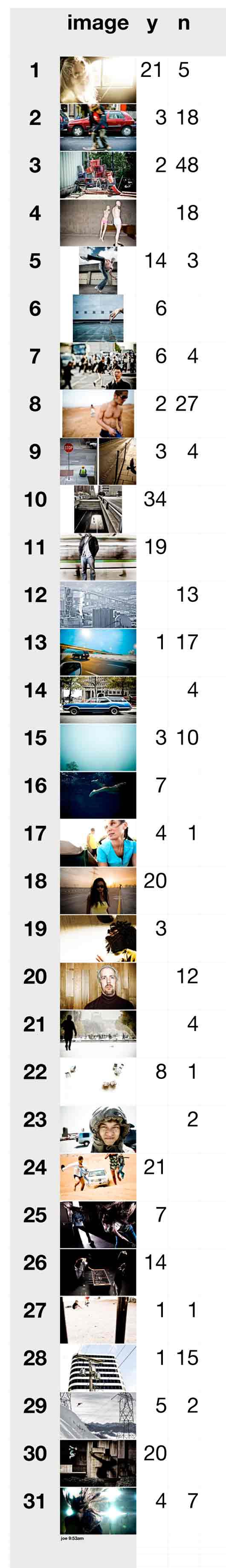
View the results of just a couple hundred comments below, and if you didn’t tally your opinions in the earlier post and want to have another perusal of the current portfolio, click here.
Well, there you have it. I’m still processing the info you’ve helped me gather, but generally speaking I’ve learned–actually been reminded–of a few things.
First, your info helped remind me that some images have a certain raw stopping power. Those tend to be the ones that people like in a survey like this (1, 11, 20, 30). Simple and graphic, emotive.
Second, is that there are images in there that you really didn’t like that ARE winners, but perhaps more subtle. What snapped me into that aha moment was that I just won a job from one of the most well-regarded ad agencies in the country. During our initial meeting after winning the job, the creative director–in a room full of smart, creative people–highlighted images 3, 13, 14, and 28 (some “losers” in the portfolio survey) as “stunning” and “subtle”.
Third, is that there is a lot more to choosing portfolio images than just the raw power of them. Ask any art buyer or photo editor – the images that are in your book often direct what kind of jobs you land and what kinds you don’t. We can’t pander to this idea, but it’s a reality that is considered.
Finally, is the idea I love the most: try to speak to everyone, and you’ll speak to no one. This is part of being a creative professional that has always intrigued me. And really, who am I trying to impress? What I need to put out there is work that is stunning and relevant mostly to me. That’s when the best, the most moving work is done. And considering that, in a commercial gotta-get-hired reality, what I’m doing only needs to impress or catch the eye of 10-30 people each year…just a handful of creative directors or art buyers and my year is flush. Sure, it’s ideal of the the art we each pump out impresses the “right” people, but ultimately those people can smell work they like from a mile away – and most often that work is highly creative, subtle and nuanced to their specific wants and needs. You could call it a perfect match. Again, try to please everyone, and you’ll please no one. Instead, come with your own vision, a tight vision, and you’ll likely connect with those with whom you were meant to connect.
Much to my excitement, my portfolio will be changing quite a bit over the next couple months. I’m really giddy about a bunch of the work I’ve put in the can recently, and as such, I’m excited to be filling a few holes with those images. I’m looking forward to chronicling more of my challenges in putting this work together and I’ll continue to share along the way. I’m planning to highlight work I’ve done with creative consultant and overall superstar Allegra Wilde (who has helped me immensely in the recent past), as well as the research I’ve done into what really moves me personally. I’m also planning to begin occasionally posting individual images in a photoblog style. Just the image and a couple of words. Of course I’d love feedback or comments on those in the coming weeks and months, as well.


")
")


? The 100% honest review...")

Hurrah! Finally I got a weblog from where I be capable of in fact obtain valuable information regarding my study and knowledge.
You and your guuests will feel more comfortable in your home.
Once inside your home, the windows look elegant and make youhr room feel spacious.
Vinyl art themes can be anything creative under the sun, and there are special designers available to make it the best.
I read this piece of writing fully concerning the
resemblance of most recent and earlier technologies, it’s awesome article.
Hurrah! Finally I got a webpage from where I know how to genuinely obtain useful information concerning my study and knowledge.
I think that everything posted made a great deal of sense.
But, what about this? suppose you typed a catchier title?
I am not suggesting your content is not solid., however suppose you added a title that grabbed a person’s attention? I mean Be My Editor
– The Results Are In | Chase Jarvis Blog is a little vanilla.
You might peek at Yahoo’s front page and see how they create article titles to get viewers to open the links.
You might try adding a video or a related picture or two to get readers interested about everything’ve got to say.
In my opinion, it could make your posts a little livelier.