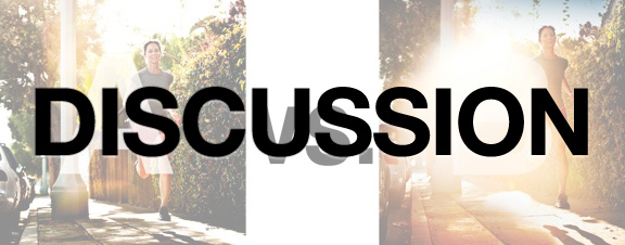
I love how opinionated this community is. There is no right, no wrong – just a good bit of discussion…
In case you’re lost, I promised to follow up this earlier popular Which Photo is Better A or B? post. The discussion on these is always spirited–in this case the post received more than 1000 comments in 24 hours–of which I read them all. A breakdown by numbers, my particular take (it was different than most of your votes), and a fascinating old JWT video that features Stephen King and a box of hammers, which subtly reveals a good bit about products and our emotions around them, all after the jump…
First, here’s a breakdown.
1. By popular voting, reader choice is Photo A. Overall opinions mostly hinged on the facts that “you could see more of the product” OR it was non-vote for B, in which the sentiment was centered on “the lens flare is too distracting”…
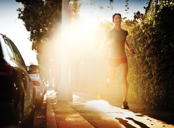
2. This advertising image was indeed shot for LuluLemon and, true to our readership popular voting, the final call on this image from the client was indeed Photo A. I like A. It’s a super solid shot. Clear. Tight. Right on brief and right on my personal style.
3. But my preference was for image B. I like the special sauce that the flare adds. That said, I certainly and completely understand the client choice – professionals always default to the people writing the checks. There are often clear marketing objective that play a role before the shoot AND many objective arise/come out during and after the shoot… In the end, to the credit of LuluLemon’s team –and they’re a really smart bunch– they really wanted to see the product since it was one of their first foray’s into running wear. I love the final image in A, but it’s perfectly ok for me to like B a little more.
Here’s why:
(First another glance at the images.)
This is PHOTO A, below.

THIS is PHOTO B, below.

First – remember I’ve talked at length before (post here: photographers push your art directors….) about my creative approach when on commercial shoots…. My initial goal: making the image from the creative brief…focused on pleasing the client, checking all the awesomeness boxes, where everybody on set looks at one another and says “we got the shot”. THEN, after that moment, push things a little bit and say “let me experiment”…push the concept a little more, check your own awesomeness box and throw that image into the mix for final selection. That was at work here. Image A was “the brief”. Image B, was me adding points of flare. In this case, a flare 😉 [*Note also that I often report on the client then choosing my “special sauce” image? Well, doesn’t always happen – as in this case here…But not to worry.]
Ok. I like image B purely because of the emotion involved. The emotion that the image makes me feel, the emotion that’s on the runners face, the emotion that I, as a runner, connect with when I go for long runs at sunset and my eye does the same thing that a camera sensor does when the sun hits it, etc. I disagree with technical arguments against this image. I worked for about 40 minutes to get this shot. The lens rendered the image beautifully, as did the camera. If you make the distraction image, I’m not buying it either. But that’s just me. I’m looking for the substance of the photo and it’s obviously not all to be found in the flare. My eyes move thru the photo.
There are always, as I mentioned above, marketing objectives that drive the content of commercial images… That’s their nature. But where the tug of war happens — and why I selected this pairing of images — is that the marketing objectives (here to make a really nice, connecting shot with the runner and the product) are sometimes at odds with a purely emotionally response based image. In fact, I believe that if you take away most of the technically-based comments below, that a majority of the people would actually connect more emotionally with Image B. Like yours truly.
Isn’t that the highest goal of an advertising image? To connect emotionally with the product or service? Debatable indeed, but it’s how I like to think about it. From both a creator perspective and as a buyer of stuff. It’s partially The client can always — and often does — think more comprehensively about the campaign than the artist who is actually shooting the campaign but my sentiment is emotion. Let the people higher on the pay scale decide the rest of the stuff…
With regard to commercial art specifically, I personally share a view shared in part by uber-planner (creative strategist) Stephen King puts it, as pulled from buddy of mine Feris Yakob over at Talent Imitates, Genius Steals:
“- communication is an indirect force rather than a direct persuasive one
– its primary role is to intensify a brand’s meaning totality (‘brand gestalt’) by creating intensity of feeling, rather than conveying rational messages
– it works most effectively by building long-term brand associations & values rather than via short-term sales shifts
– a planner’s role (photographer’s perhaps) is to … not get dragged into the nightmarish mechanistic false world of purchase intent methodologies.”
Pretty much sums up why we need to be pushing creativity to clients that we believe in, right? Ultimately they make choices based on bigger spheres, budgets, jobs, goals, etc than we do creating the work, BUT it shouldn’t keep us from making the stuff we feel is most creative after you “get the shot”.
What say you?
[Final departure: here’s a funny old 1970’s JWT agency video where these gents articulate in/around the emotional side of hammers and dress suits. Worth the 90 seconds if you like this stuff. ]


Chase –
I think Triumph’s most recent marketing campaign, leading to the release of two new motorcycles, parallels the emotional appeal you captured in Photo B. They certainly wanted viewers to see their new product and associate the brand “Triumph” with the emotional response they experienced, but I think they were careful to focus more on the emotional appeal than the product itself. This is especially true with the teaser videos they released leading up to the complete “reveal film.” Follow this link to check out their final video.
http://www.triumphadventure.com/
After the video is complete, be sure to click on the “video” link at the bottom to see the teaser films that led to the final video. I hope everyone finds these videos to be as relevant (and exciting) as I did!
Enjoy!
please chase can you teach the lighting for this shot, I really want to know and learn ?
PLEASE !!!!!!
Formula: Product+Production+Emotions+Art= Branding. I agree with you Chase, I like the artistic vision and emotion of the picture B.
“I worked for about 40 minutes to get this shot.” – Chase, the brutal truth is that it does not matter to the average viewer. They probably think you shot it quickly because you are a good photographer.
On closer inspection the expression on the face on image A may be indeed slightly more pleasing (i have not noticed it at first because of the flare – really). And as for the EMOTION – i do not like when the sun shines in my eyes! Shot A is a winner for me.
I’m sorry they didn’t go with your favorite image. I know that as an artist it’s nice to see when others look at one of your images and shares the same emotion that you have when you took the picture. It would have been interesting to see the results had you not given any context in initial A vs. B post. I think its one of the caveats of being a professional photographer that you sometimes have to swallow your pride and please the client. I hope this doesn’t discourage future A vs. B posts.