

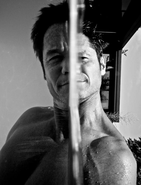
Here’s the Photo of the Day.
Like it or not? I’d love to know, and it would be good for everyone if you told me why.
[BTW, this image is from our “OGI” file. What’s that? Well…when Scott and I are editing photos after a shoot, combing through thousands to find the select few that see the light of day, we employ a practice that I can’t recommend highly enough. That practice is to put those surprise images–the unexpected happy accidents that have merit, but maybe aren’t relevant to the job we’re editing–into a file of their own with other like-minded (bizarre, unique, etc) images. We call that file “Otherwise Gifted Images”. That’s sort of what I meant by the title of this post. It’s got a double meaning… in one sense, like this image or not, the practice of saving random, unexpected stuff to a common file, or tagging it a certain way, is a good practice. In another sense, I do want to know if you like this photo or not. I’m bias, but I love it. In fact, I took a spin through that whole file last night and fell in love all over again with about 40 photos.. I’ll be sharing more of them over time.]












And to answer the question which I forgot: Yes I like it. There’s a great potential in this picture and I think a small amount of further tweaking would bring it to “the max” =D
Losing the house from the background would make it awesome. The tree is the first one that gives the orientation out (quite swiftly despite what some say) and editing that one out would already make the effect more enjoyable.
So at least the tree out of the picture and finding out how to achieve this with the model having less squinted eyes (clearly a situation where it’s quite hard for the model =) would make this probably even better.
Additionally editing out that small tree top peeking from the right side (or top) of the house would put out a bit of distraction. I like that the trees in the lower right corner is OK as they balance the composition with the house above.
Also. I really like the light in the left part with caustics and everything. Giving just a hint of boost for the light on that side might do good, maybe even boosting it partly. The right side is now a bit contrast-heavy compared to the left side (even though I like the contrast-contrast 😉 that actually my eyes clearly wander mostly on the right side and all the coolness of left seems to be left slightly out despite of the greatness of the texture of the reflective light.
I hated it at first… I couldn’t figure out what I was looking at. After I studied it and figured out what it was, I began to fall in love with it. The center divide is a bit bright and distracting, so it is kinda hard to look at, but I think the subject matter overrides that. I really like it now.
I like it, but I’d change the orientation to Horizontal. Perfect example of how trying new things leads to extraordinary photos.
I find it a little disturbing, but I liked it even before I figured out how it was taken. That little moment of realisation made me like it more.