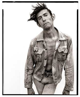
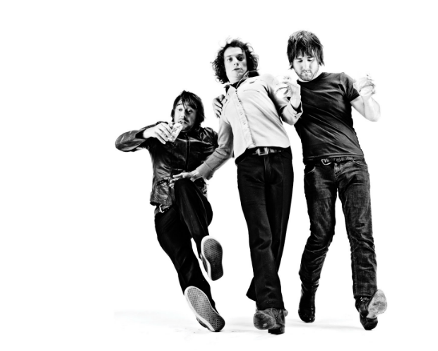
When I was a less experienced artist, I thought that less gloss meant less talent. For, after all, it seemed to me to be commonly assumed in our culture that talent resided only in the gloss, the perfection, and the polish. If your art didn’t have polish it was only because you we’re able to apply it.
Now, I tend to feel just the opposite. Gloss, more often than not, acts as a substitute for soul, a clear vision, intent. It’s certainly more challenging to find the perfect vintage car to purchase than it is to select a shiny new sports car. It seems like gloss too often is the easy way out.
Photographically, for me, this translates away from traditional, more “perfect” images and toward the more real moments. It’s the off moments, or rather the “un-moments” that make stronger, more emotionally charged images. Those images feel more like my life—far more imperfect and far more relevant.
 There are a million images around us to prove my point. Think of the work of so many masters. Cartier-Bresson. Think of Warhol’s photos, of Avedon’s. Or more modernly, of Ryan McGinley’s or Chris Buck. Examples from my own work can be found in the Seattle 100: Portrait of a City book
. I shot 100,000 images for that book, and the ones the made the final 300-image book edit were almost always this “un-moment” of which I write. These un-moments–these instants just before and just after those photographic moments that have been so historically revered in our culture–seem so much more revealing, engaging, and meaningful. My growing experience tells me that this sliver of time that captures the spontaneous and the genuine and pierces through the façade of a conventionally “perfect” portraits does so in a way that more accurately reveals the truly human.
Certainly there are exceptions to my hypothesis abound – where polished images succeed – its simply my hope that we suspend our de facto acceptance of the new-and-polished and recognize that it’s more often something gritty that challenges us to find a deeper aesthetic, take a longer vision and seek more soulful connections. Put simply, “gritty” may require more emotional and metaphysical investment from us viewers, but it is far less deceitful than “glossy” and creates a far greater opportunity for culturally-relevant, creative success.
[this post is adapted from a piece on design that I origially wrote for Arcade Magazine]


Regardless of the “-moment” the image should force the viewer/audience to explore the content within the frame. Look at some of the images that Gregory Crewdson makes which are very polished and thought provoking. He strives for perfection. It’s the content of the image, polished or gritty, combined with preparation, spontaneity, timing, luck, etc. that have a lasting value on the viewer. Yes Chase, there are “exceptions” and making gritty images is my first choice. But putting it into the right context that many of the polished images we see are manufactured to sell us something and that’s what helps the photographer pay the bills. Great thought provoking and gritty post, thanks Chase!
Very thought provoking post. But I disagree with your formulation of these ideas. Perhaps it is because “Gritty” and “Glossy” are pretty slippery terms and you have set them up in the title as absolutes. Also I’d say that you are not claiming anything about the “Deceit of Perfection,” but rather the opposite. You are encouraging perfection. Avadon (who’s image from “In The American West”) you have included, shot for a number of years and went through thousands of images to get a little more than 100 finished photos. That is a complete striving for perfection. Cartier-Bresson is known for “the decisive moment” ie the one perfect moment. These are not “un-moments.” They are, by your own terms and description of your editing process, very very specific moments. Perfect moments. Don’t get me wrong. I love the photos you have show, both yours and Avadon’s. But I think you have set up a contradictory way of thinking about them – especially given the history of photography.
Avadon, for example, received a commission to do street photography in Harlem in the late ‘60s. He ended up returning the money. He was uncomfortable taking pictures without engaging the subjects and felt other photographers were better at it. It was not until he could bring the “glossy” studio into the field that he could make the work he wanted. Perfect work – glossy work – very controlled work. The subject may be gritty, but the photography is highly polished.
In contrast Geoff Dyer has written a wonderful book called “The Ongoing Moment” which sets up a way of thinking about photography which stands in opposition to “the critical moment.” Well worth the read. Interestingly, Dyer is not a photographer.
But, thought provoking post, and I tip my hat to you for starting engaging discussions.
Tim
>>> “…this sliver of time that captures the spontaneous and the genuine and pierces through the façade of a conventionally “perfect” portraits does so in a way that more accurately reveals the truly human…”
It’s also called BLINK. See Malcolm Gladwell at http://www.gladwell.com/blink/
I live by it too! Keep up the good work, and keep BLINKING Chase.
Isn’t it what the difference is between real life and a set-up situation…what we think something should be or look like?
In our society “image” always played a bigger role, somehow we seam to be attracted to that polished patina, Isn’ it what advertising is all about, selling an image? Nothing wrong with the glossiness as long as we don’t take it for the real thing!
Yeah, I agree with Chase. You connect better with gritty stuff because you see gritty stuff everywhere, gritty is what you know. Glossing stuff out is creating emotional distance. Which is why some people like it so much.