A few days ago Moni Basu of CNN published a provocative piece comparing the photography of War to the photography of Fashion.
Whether this is an absurd evocation, an intellectual exercise, or an astute reflection I’m not calling it. I can’t. But the idea of taking an individual photographer who has shot both war and fashion and juxtaposing images from the two bodies of work, was curious and very disturbing. At one end, sure, there’s the composition and technique – brilliantly and noticably similar…at the other end of the spectrum is the danger of belittling such a weighty topic as war with such a flippant topic as fashion. All in all, plenty of tension, which is why I thought this a worthy share.
I still don’t know what to think. Generally speaking its not a surprise that popular reactions worldwide to this piece have been swift and, dare I say it, overwhelmingly unflattering. Basu has been quick to defend herself by explaining:
We are not comparing war to fashion. We are comparing the photos that come from those disparate circumstances.
But can you compare the photos taken of disparate circumstances without comparing the circumstances themselves? It’s a big stretch to take for the sake of alliteration. Just as Basu took the scales to the two forms of photography, we should take them to her project. On the one hand, I understand the goal of juxtaposition for being evocative. Whether bravery or naiveté, it takes a large dose of both in large doses to dive right into the deep end, which is what she did.
This project will always be an invitation for serious criticism and judgment. Write what words you may write around the images, but sitting an image of American soldiers at the same table as runway models with the title “War & Fashion” at the head is a guaranteed poke with a sharp stick for many. Even for those opposed to war (or fashion for that matter).
I wrote about wartime photojournalists a few weeks ago in part to celebrate the individuals who took the photos but also to appreciate the work itself. Although I threw up a sequence of shots, each photo really deserves to stand on its own — such is the emotional impact they have. It’s hard to imagine comparing say, Eddie Adams’ iconic Vietnam photo to a model having her makeup put on.
I guess I “get” it, but I’m not sure on the issue of taste. But then, I’m no Moni Basu.
[If this topic is unsettling to begin with, please don’t scroll down to look at the photos. And please no ranting. Opinion yes, thrashing, no. This is intended/shared with the goal of critical reflection and respectful discussion only.]

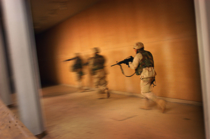
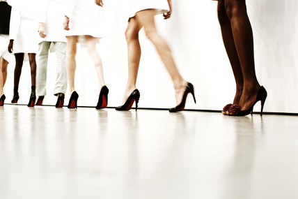
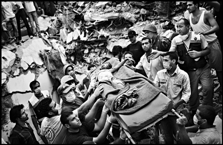
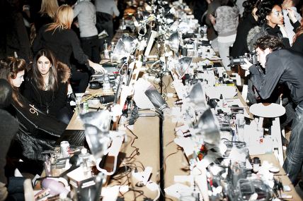
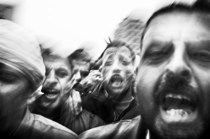
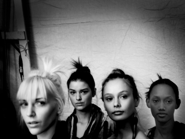
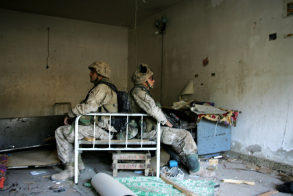
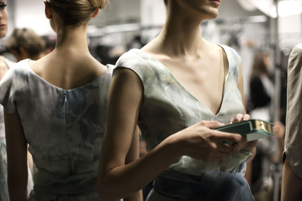
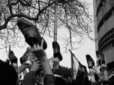
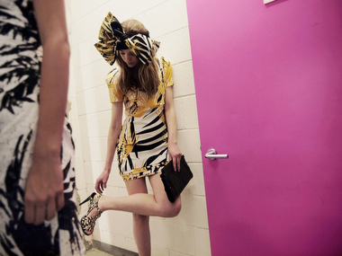




1) form is a structure of relations
2) content is a depiction of objects
The similarities between the fashion and war photographs are mostly due to the state of affairs due to the formal structure of the images. These structures are abstract and therefore remain hidden to people unless they are educated and trained in the arts to the extent that they know how to identify and name then when they occur. Since these structures are abstract, they are not dependent on content. This makes them relative.
Meanwhile, content is the objects that are depicted. If people are disturbed by the photographs, it is due to the objects depicted (wounded people, funerals etc) rather than the formal structure of the photos.
To the extent that people are capable of recognizing art, they will see the form regardless of content. To the extent that people are superficial and material, they will see the objects depicted regardless of the formal structure holding them together.
It borders close enough to interesting to inspire some contemplation. Maybe this has been suggested, but I think having fashion poses that were close to the fighting and death poses would have been damn offensive… and REALLY effective. People need a jolt; a swift kick in the ass to get them out of the consumer trance.
I don’t have the resources to do such a project, but mabey a photog out there who has both shots to do some composits/overlays of fashion and warfare. That would be disruptive.
I would like to see more of the pairings, the first two I could make a leap of faith between the juxtaposition. By the final set i was wondering why the emotion of the imagery wasn’t similar. I found I wanted it to be about the commonalities of the human condition. I wanted to juxtapose the running to the runway and the running to the corner. I saw anger juxtaposed against waiting. I didn’t get it either.
Seems to me this is mostly about how the photographers perceive their surroundings/subjects (subconsciously, perhaps) than any particular message about either war or fashion. One could have just as easily juxtaposed sports photography with, say, wild animal photography. It just wouldn’t draw as an emotional response. Or pageviews for CNN, if I’m being cynical. 😛
very interesting comparo but i dont agree much on the similarity.