

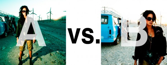
Alrighty. Regardless of the fact that this A or B series (here, here, and here) has been really interesting for us, helpful, and popular with you (the last such post received over 1000 comments in 24 hours)…
This time it is of even greater interest for us. You see, we’re doing some image editing around here and we’ve stumbled into a little internal debate about which one of these two images is actually better, A or B. [You might remember these shots from the Nikon D7000 campaign…]
Hearing from you will help really help us. No qualifiers, don’t worry about our objectives, or the “assignment”. We want to know which one of these shots you like better. And please tell us in the comments below, not via twitter. Raw preference. Period. If you can add some “why”, that would be nice too. Full 600 pixel wide images after the jump. Hit ‘continue reading’ below [and btw, I’ve got a $1 gentlemen’s bet riding with Erik about which one will win, so don’t let me down!]…
After you all weigh in, I’ll tell you which one I like, which one I thought you’d like, and why.
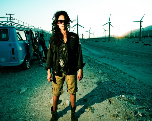
This is image A, below:
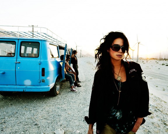
This is image B, below:
So which photo is better? A or B?












B for me. The shadow in A gives it a more ‘fake’ feel. I like the peanut gallery in the back ( 😉 ) and think that they are more noticeable in B. They give the picture more atmosphere. Also the ‘previews’ of the pictures are in Square crops, and B definately looks better in square than A.
I would however also pick B given the uncropped versions.
B is better. The pose of the girl in A looks so uncomfortable that it’s distracting. I also prefer the lighting in B, brighter, more alive and positive.
Image “B”. It has more emotional impact, it has some attitude and tells more of a story. “A” is more static and looks a bit posed even thought there is an interesting “mis en scene”, but in “B” the image has a more “focused” subject. (Not “in focus”)
I like B more. The model looks better in B, the lighting looks more natural, and the van looks good too. In A the only thing that is being shown is a model with lots of contrast and windmills. Unless its for a alternative engery advertisement I say go with B.
B. it looks more natural. In A the lighting seems artificial and the colors look over-edited