Alrighty. Regardless of the fact that this A or B series (here, here, and here) has been really interesting for us, helpful, and popular with you (the last such post received over 1000 comments in 24 hours)…
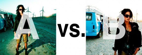
This time it is of even greater interest for us. You see, we’re doing some image editing around here and we’ve stumbled into a little internal debate about which one of these two images is actually better, A or B. [You might remember these shots from the Nikon D7000 campaign…]
Hearing from you will help really help us. No qualifiers, don’t worry about our objectives, or the “assignment”. We want to know which one of these shots you like better. And please tell us in the comments below, not via twitter. Raw preference. Period. If you can add some “why”, that would be nice too. Full 600 pixel wide images after the jump. Hit ‘continue reading’ below [and btw, I’ve got a $1 gentlemen’s bet riding with Erik about which one will win, so don’t let me down!]…
After you all weigh in, I’ll tell you which one I like, which one I thought you’d like, and why.
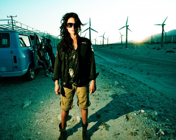
This is image A, below:

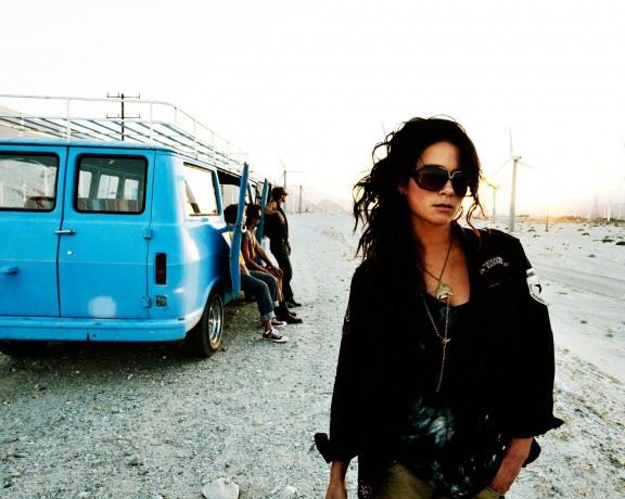
This is image B, below:

So which photo is better? A or B?


B
A. I find the depth of background and voluminous side-lighting more engaging than the subject matter and flatness in B.
b. b because i wan’t the picture to talk me about sharing moments with friends. I read this as an introduction of the lady in the foreground; something like ‘Hi me and my friends we are so cool… we even go in the desert with a vintage vagon to enjoy the sunset far away from city chaos’ .
picture ‘a’ gives me bad feelings; the lady is alone botween people, I don’t like it.
Definitely (B). It appears to be much more natural and conveys a stronger story. (A) looks a bit “fake” or forced.
A
I like the artificial light on the model, I think it makes for a stronger image. It highlights the model herself while you can still make out details in the background. B feels soft and washed out, and the van is too prominent.