Chase Jarvis Chase Jarvis
  • Photos
  • Projects
  • About
  • Blog
  • Book
Chase Jarvis Chase Jarvis
  • Photos
  • Projects
  • About
  • Blog
  • Book

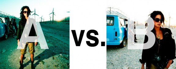
Which Photo is Better: A or B?

Alrighty. Regardless of the fact that this A or B series (here, here, and here) has been really interesting for us, helpful, and popular with you (the last such post received over 1000 comments in 24 hours)…

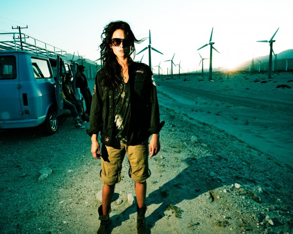
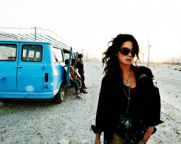
This time it is of even greater interest for us. You see, we’re doing some image editing around here and we’ve stumbled into a little internal debate about which one of these two images is actually better, A or B. [You might remember these shots from the Nikon D7000 campaign…]

Hearing from you will help really help us. No qualifiers, don’t worry about our objectives, or the “assignment”. We want to know which one of these shots you like better. And please tell us in the comments below, not via twitter. Raw preference. Period. If you can add some “why”, that would be nice too. Full 600 pixel wide images after the jump. Hit ‘continue reading’ below [and btw, I’ve got a $1 gentlemen’s bet riding with Erik about which one will win, so don’t let me down!]…

After you all weigh in, I’ll tell you which one I like, which one I thought you’d like, and why.

This is image A, below:
This is image B, below:
So which photo is better? A or B?

Related Posts

10 Things Every Creative Person (That’s YOU) Must Learn
051026_ChaseJarvis_einstein_writing_vlrgwidec
Writing Makes Photographers More Creative — 5 Easy Tips
Daniel Pink: The Power of Regret
Chris Hutchins of Chase Jarvis LIVE
Chris Hutchins: All the Hacks to Maximize Your Life
Chris Burkard on Chase Jarvis LIVE
The Wayward Path of Photographer Chris Burkard
Make Your Message Heard with Victoria Wellman

1,204 replies on:
Which Photo is Better: A or B?

Comments navigation

Previous
Next
  1. Ian Rook says:
    February 15, 2011 at 10:16 am

    I have no doubt that it is image A.
    Whilst I am struggling to quantify exactly what it was I felt, image A gave me an immediate emotional response that I just don’t get with image B.
    The contrast, lighting and crop and definitely a key part of A’s raw power.

  2. Lars says:
    February 15, 2011 at 10:16 am

    A!!! It tells a story and it catches me.

    i don´t like the blown out parts of B

  3. Jeff Harper says:
    February 15, 2011 at 10:16 am

    I like A better, better separation via better front and back lighting of the subject, shadow on face creates mystery and mood, and B has too many well lit artifacts (van and inattentive guys) that draw away from subject.

  4. Misa Garcia says:
    February 15, 2011 at 10:16 am

    Definitely B = Composition works even though it’s overexposed.

    You color corrected A to try and trick us!

  5. Adrian says:
    February 15, 2011 at 10:16 am

    B… is the one that I prefer, is more dynamic and has more story to tell, seems like the girl is going for some reason and guys behind are ignoring this. I don’t prefer A because seems too artificial something like guys are looking somewhere and the girl has coming there in fron a stopped for taking a photo 🙂

    Cheers
    Adrian

Comments navigation

Previous
Next

Comments are closed.

BUY NEVER PLAY IT SAFE NOW!

Get weekly, curated access to the best of everything I do.

Popular Posts

20250916_CJLIVE_HowMuchIsEnough_Micro_Thumb_16x9_v2.5The Most Important Question You’re Probably Not Asking: How Much Is Enough?
20250826_CJLIVE_DontTradeDreams_Micro_Thumb_16x9_v2.5Don’t Trade Your Dreams for Security
a close-up of a bearded man with short, graying hair wearing a light blue button-up shirt. The text beside him reads "Mastering the 3 Types of Conversation" in bold white and yellow letters. In the top right corner, the show’s logo, "The Chase Jarvis Live Show," is displayed in yellow and black. The background is black, making the text and the individual stand out prominently.The #1 Mistake That Ruins Most Conversations
A smiling man in a blue shirt, positioned against a black background with bold white text on the right that reads "STOP WASTING TIME." In the upper right corner, a yellow box contains the logo "The Chase Jarvis LIVE Show." The image has a bright yellow border.The Dark Side of Productivity Myths Exposed
Héctor García and Francesc Miralles smiling, with bold text in the center reading '4 Steps to Discover Your True Purpose' on a black background. Framed with a yellow border, creating a high-contrast, engaging design.Why You’re Not Finding Your Purpose
A portrait of Israa Nasir, a psychotherapist, set against a black background with bold white text that reads, "Why Rest Feels Like Failure," framed by a yellow border and a small "The Chase Jarvis Live Show" logo in the top-right corner.Toxic Productivity Is Killing Your Success
20241030_CJLIVE_BrianSolis_Blog_16x97 Ways AI is Transforming Creativity
20241219_CJLIVE_AaronLeventhal_Thumb_16x9_v2.5Beyond Midlife: How Can ‘The New Fit’ Guide Your Health Journey?
20250204_CJLIVE_AmieMcNee_Thumb_16x9_v2.5Stop Waiting for Permission to Create—Here’s How to Start
20250320_CJLIVE_JennyWood_Thumb_16x9_v2.5What’s Stopping You From Taking the Risk That Could Change Everything?

Daily Creative Projects

© 2024 Chase Jarvis. All rights reserved.