A while back I had Grammy Award Winner, Sir Mix-A-lot on chasejarvisLIVE. The guy is smart – dropped some pretty serious knowledge on the show [here’s the re-watch if you missed it].
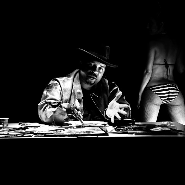
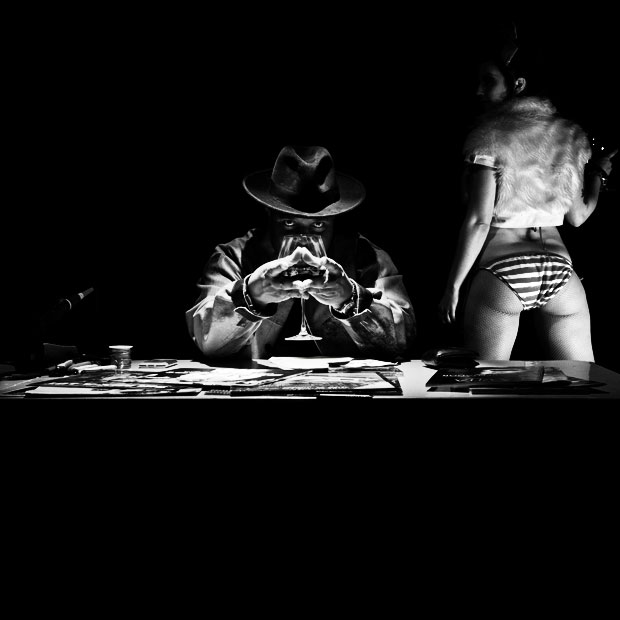
At the end of the show, I shot the cover for his upcoming album, live, online. Here are the results.
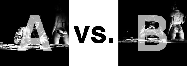
The lead one that shows his face is my fav, but there’s plenty of debate, because the other shot is tough and mysterious. I’ll resist the temptation to make any real case for one or the other, and I’ll let this is a straight up survey – which photo do you like better A (top) or B (bottom)? (please answer in the post, not via other social channels so we don’t have to chase your feedback – thx!)
Thanks for your input.
||And if you missed it: Here’s the chasejarvisLIVE episode with Mix||


Photo A, by a mile.
B: The woman is posed better, and the mysterious pose of the rapper works better with the black & white colors and overall mystique .
The B photo begs for further attention, maybe photo A could become its continuation in the inner sleeve or somewhere.
B is the mysterious invite and A reveals the face one you open up the sleeve
As they are I like “A”, but I think I would like “B” better if it were cropped in tight to emphasize the eyes more. The photos show two distinct sides of this artist. Maybe use both…one for the A-side and the other for the B-side of the cover (but I would crop “B” down)
Definitely B. The mysterious look captured my attention in a more engaging way than the first.
further, I think that if you decide to use B, perhaps (and this will bother many), a tighter crop on SMAL, and drop the girl altogether. Yeah…I know….BOOOO!