A while back I had Grammy Award Winner, Sir Mix-A-lot on chasejarvisLIVE. The guy is smart – dropped some pretty serious knowledge on the show [here’s the re-watch if you missed it].
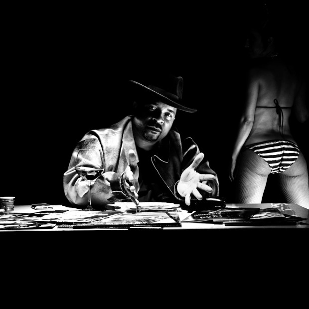
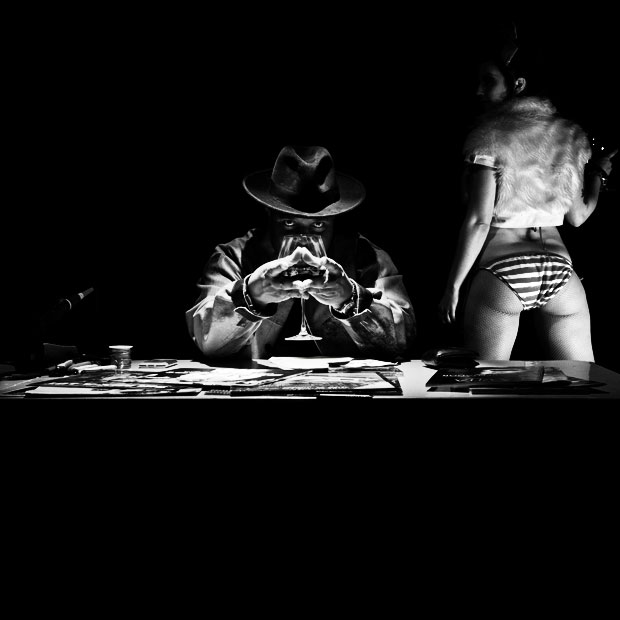
At the end of the show, I shot the cover for his upcoming album, live, online. Here are the results.
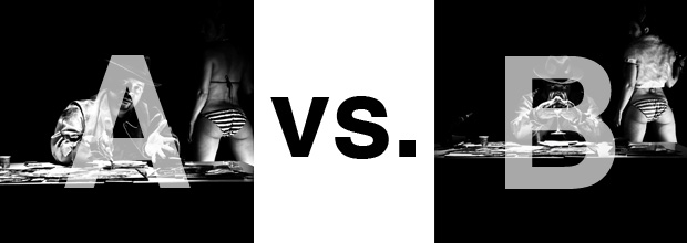
The lead one that shows his face is my fav, but there’s plenty of debate, because the other shot is tough and mysterious. I’ll resist the temptation to make any real case for one or the other, and I’ll let this is a straight up survey – which photo do you like better A (top) or B (bottom)? (please answer in the post, not via other social channels so we don’t have to chase your feedback – thx!)
Thanks for your input.
||And if you missed it: Here’s the chasejarvisLIVE episode with Mix||


At first glance I thought “A,” without hesitation. BUT, the more I looked at them “B” became my favorite choice. More interesting story in that photo.
Photo A.
Too much focus on the girl in the B.
B since I’ve seen Sir-Mix-A-Lot’s photos over the decades with the same look in A. B would be something different for once 😉
I think A is more expressive and powerful
Going with B, just the eyes. He’s a legend, you don’t need to see his face to know who he is..especially with the booty shot next to him. It kind of says to me, “You know who I am already, you don’t need anymore than what I give you” However, I do like the girl from A better, not keen on the fur and showing the face…I think just his eyes and the booty. Everything else draws away from those.