Chase Jarvis Chase Jarvis
  • Photos
  • Projects
  • About
  • Blog
  • Book
Chase Jarvis Chase Jarvis
  • Photos
  • Projects
  • About
  • Blog
  • Book

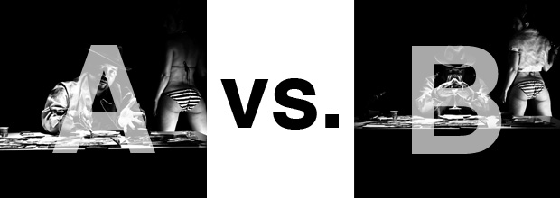
Which Photo is Better A or B? [Sir Mix-A-Lot Album Cover]

A while back I had Grammy Award Winner, Sir Mix-A-lot on chasejarvisLIVE. The guy is smart – dropped some pretty serious knowledge on the show [here’s the re-watch if you missed it].

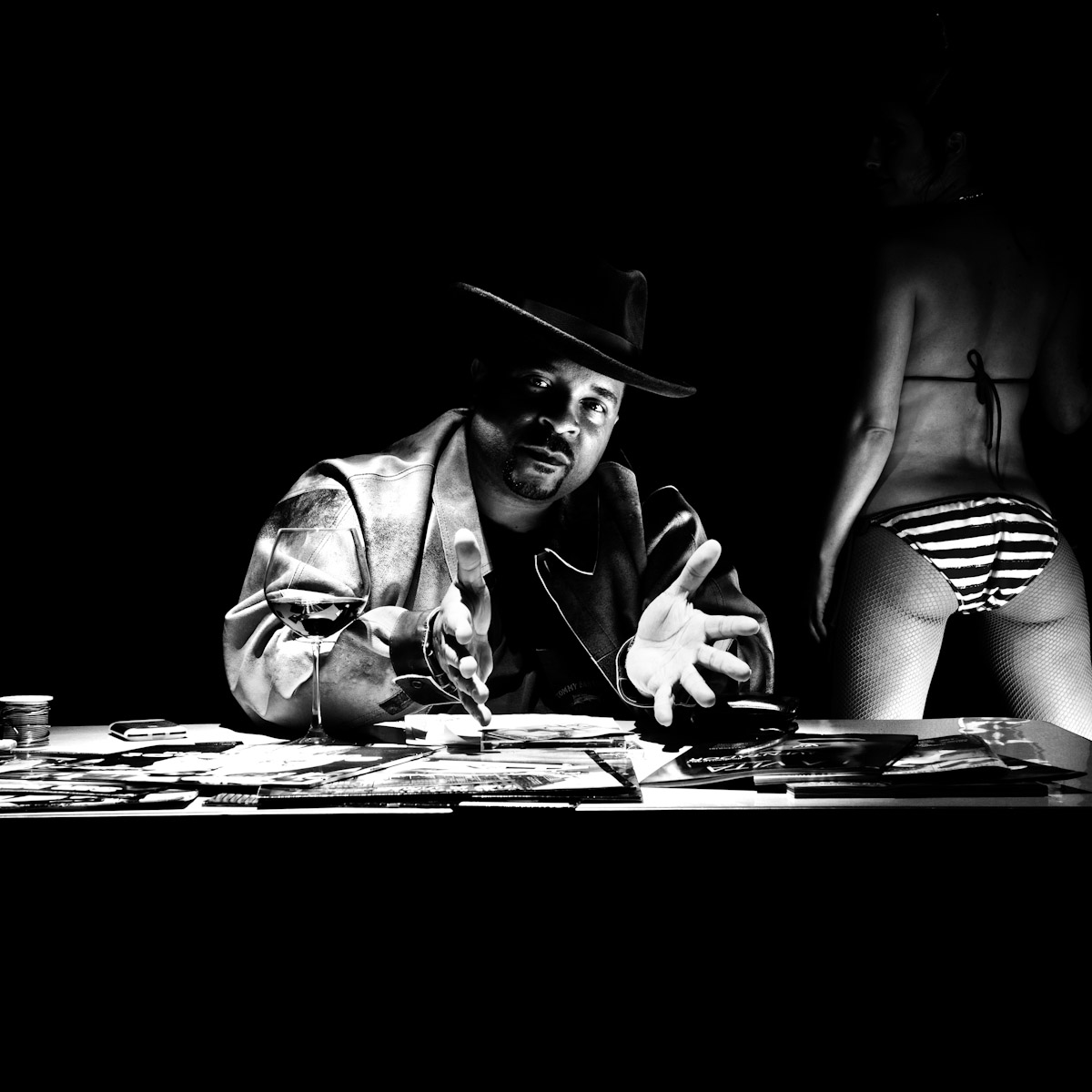
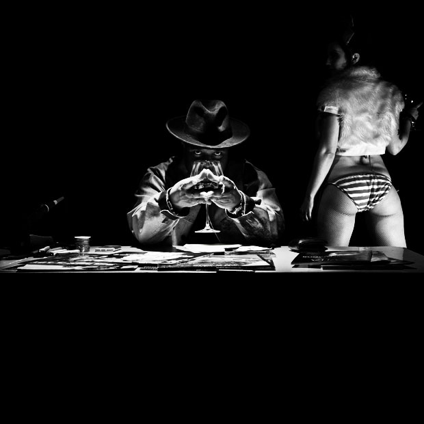
At the end of the show, I shot the cover for his upcoming album, live, online. Here are the results.

The lead one that shows his face is my fav, but there’s plenty of debate, because the other shot is tough and mysterious. I’ll resist the temptation to make any real case for one or the other, and I’ll let this is a straight up survey – which photo do you like better A (top) or B (bottom)? (please answer in the post, not via other social channels so we don’t have to chase your feedback – thx!)

Here is photo A:
Here is photo B:
So which is better??

Thanks for your input.

||And if you missed it: Here’s the chasejarvisLIVE episode with Mix||

Related Posts

10 Things Every Creative Person (That’s YOU) Must Learn
051026_ChaseJarvis_einstein_writing_vlrgwidec
Writing Makes Photographers More Creative — 5 Easy Tips
Daniel Pink: The Power of Regret
Chris Hutchins of Chase Jarvis LIVE
Chris Hutchins: All the Hacks to Maximize Your Life
Chris Burkard on Chase Jarvis LIVE
The Wayward Path of Photographer Chris Burkard
Make Your Message Heard with Victoria Wellman

743 replies on:
Which Photo is Better A or B? [Sir Mix-A-Lot Album Cover]

Comments navigation

Previous
Next
  1. Michael says:
    September 15, 2011 at 7:36 am

    I prefer A as this is MixALots style. b os too dark

  2. Ofir Abe says:
    September 15, 2011 at 6:30 am

    i like B better.
    it’s less Posed and more intriguing.
    i think it can be cropped and zoomed in on top of hat till the bottom part of the wrists for other elements of the cover like the graphics on the CD itself.
    this could be iconic.

  3. Joseph Nienstedt says:
    September 15, 2011 at 5:52 am

    Definitely B for me. It’s just graphically more pleasing – although the panties are literally in a bunch!

  4. Fredrik Pilo says:
    September 15, 2011 at 3:52 am

    A – I like the open hands, that gives more story for me at least.

  5. Cris says:
    September 15, 2011 at 1:38 am

    A is better pic for inside jacket, B is more interesting and would make a better cover.

Comments navigation

Previous
Next

Comments are closed.

BUY NEVER PLAY IT SAFE NOW!

Get weekly, curated access to the best of everything I do.

Popular Posts

veo sensitive contentHow To Fix Veo 3’s “Sensitive Content” Warning
capcutCapCut For Creative Pros: Is It More Than “The TikTok Editor”?
Fluffy-Monsters.max-1080×1080.format-webpHow to Use Nano Banana Pro for Free (Without a Watermark)
Asset 14kling ai logoKling AI Video: Is it good for creative pros?
veo higgsfield y2k girlHow to Turn A Photo Into Video with Veo 3.1
lora thumbHow To Use LoRAs in Weavy (vs ComfyUI)
weavy nano banana style referenceBest Generative AI Canvas Apps for Creative Professionals (Weavy, Flora, Freepik, etc)
nano banana edit thumbHow To Edit Images In Nano Banana Pro (inpainting)
Asset 12runwayRunway AI: Honest review for creative professionals
comfyuiWhat the heck is ComfyUI? And is it right for creative pros?

© 2024 Chase Jarvis. All rights reserved.