A while back I had Grammy Award Winner, Sir Mix-A-lot on chasejarvisLIVE. The guy is smart – dropped some pretty serious knowledge on the show [here’s the re-watch if you missed it].
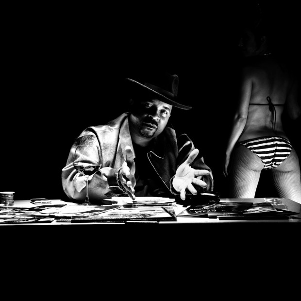
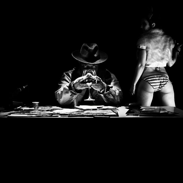
At the end of the show, I shot the cover for his upcoming album, live, online. Here are the results.
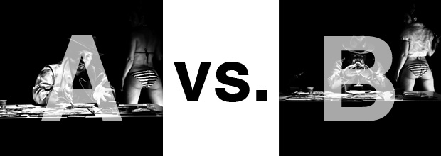
The lead one that shows his face is my fav, but there’s plenty of debate, because the other shot is tough and mysterious. I’ll resist the temptation to make any real case for one or the other, and I’ll let this is a straight up survey – which photo do you like better A (top) or B (bottom)? (please answer in the post, not via other social channels so we don’t have to chase your feedback – thx!)
Thanks for your input.
||And if you missed it: Here’s the chasejarvisLIVE episode with Mix||


Each of the pictures have their own unique story. I would say that the photo that best reflects the vibe of the album is the winner. Connect the visual to the audio, let the whole package be cohesive to communicate the emotion(s) that the artist is looking to convey. Do the tunes have a more personal viewpoint? Then A. If it’s more brooding and dark, then B.
A. Brand recognition.
B is better.
A has a lot of lines directing the viewers gaze to the woman’s butt. A is the safe, boring shot.
B focusses energy on the symmetry of the glass/hands/face/hat. The glass is, as David Lynch says, very fast.
Even with fur and a face, it’s easier not to be drawn away from the focus of the image in B.
meant wine glass is NOW a repeating form
I actually like A better because you can see his face and the perspective is closer in. THE PROBLEM with this is that it is TOO much one note about Baby Got Back….her butt…his cupping positioned hands.
Photo B takes me to a new place. The wine glass is not a repeating form on her hour-glass figure and he is showing off some new mystery in his eyes…..The mic is not one for singing, but rather a talk program. A little more intrigue & dimension.