A while back I had Grammy Award Winner, Sir Mix-A-lot on chasejarvisLIVE. The guy is smart – dropped some pretty serious knowledge on the show [here’s the re-watch if you missed it].
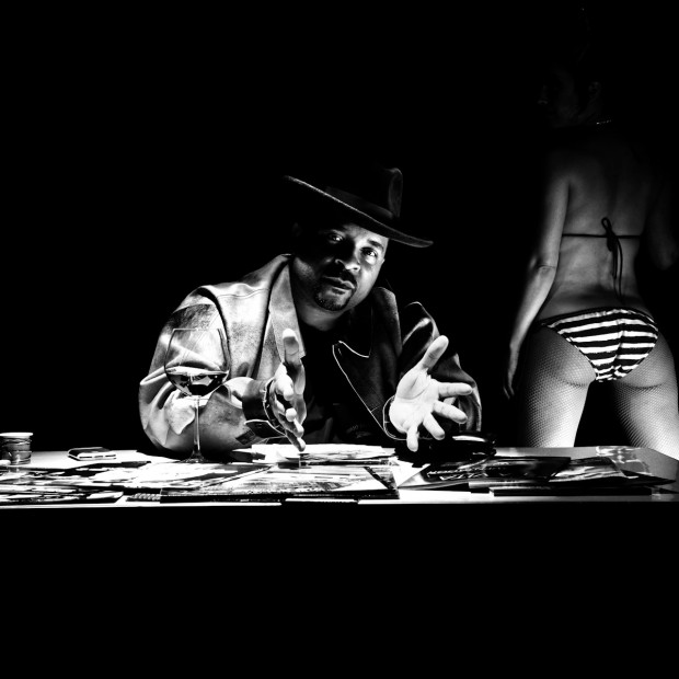
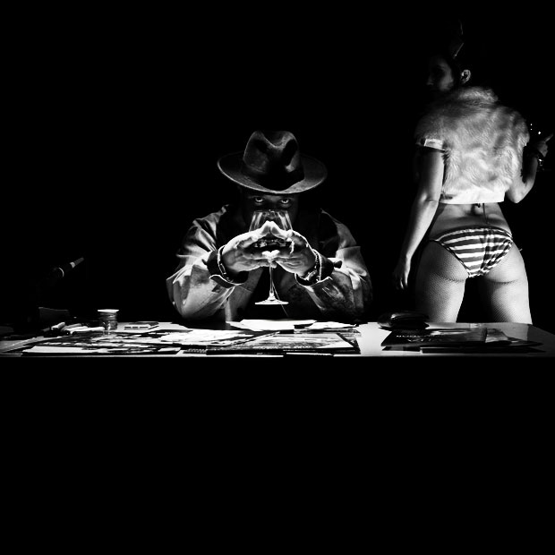
At the end of the show, I shot the cover for his upcoming album, live, online. Here are the results.
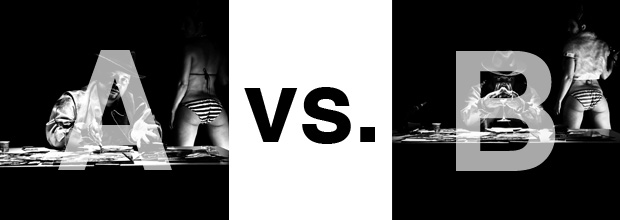
The lead one that shows his face is my fav, but there’s plenty of debate, because the other shot is tough and mysterious. I’ll resist the temptation to make any real case for one or the other, and I’ll let this is a straight up survey – which photo do you like better A (top) or B (bottom)? (please answer in the post, not via other social channels so we don’t have to chase your feedback – thx!)
Thanks for your input.
||And if you missed it: Here’s the chasejarvisLIVE episode with Mix||


I like B, but not such a fan of the eyes in that version
CWDaly
B.
Much more fitting for an album cover. i prefer the girl without the fur, but that aside i still think B is more mysterious and will probably help sell records more then A.
i pick B, the reason is
1. it’s an album cover so it has to stand out from the rest on the album racks on the store.
2. because it’s mysterious people will be more likely to pick it up and look
3. because it’s juxtaposition between the main subject and female model and also the props is out of the ordinary will likely to increase it’s chances to be picked up.
4. even though it may seem there’s many distractions in the shot…but says who perfection sells. human being is imperfect in every sense and that’s why i like it.
B
B is the best shot. Did no one notice the semi-wedgy in the girl’s ass though? I hope that is edited out before being released!