


A while back I had Grammy Award Winner, Sir Mix-A-lot on chasejarvisLIVE. The guy is smart – dropped some pretty serious knowledge on the show [here’s the re-watch if you missed it].
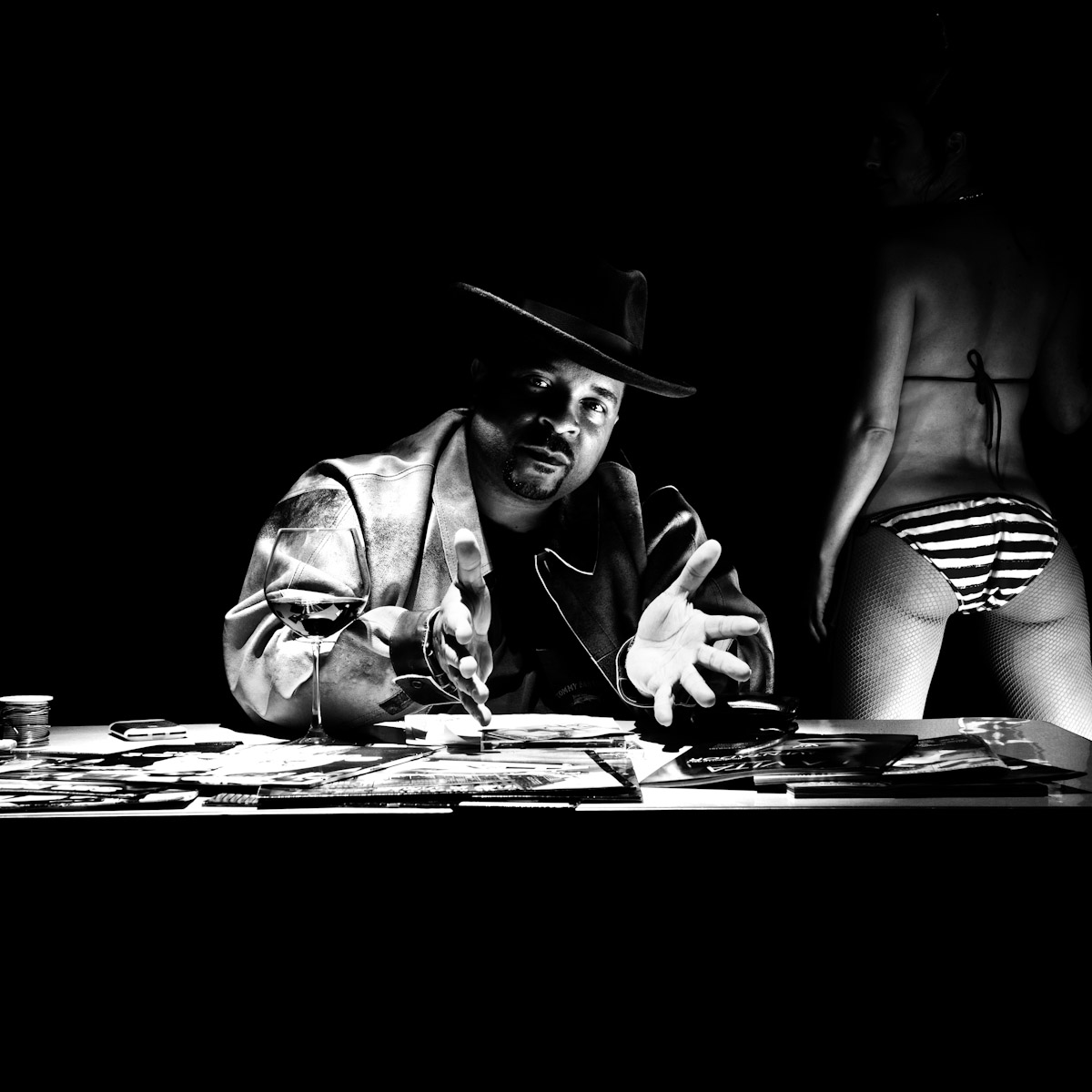
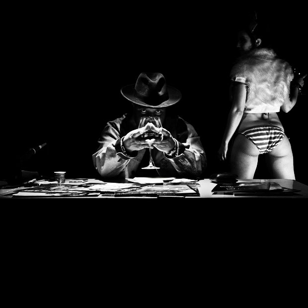
At the end of the show, I shot the cover for his upcoming album, live, online. Here are the results.
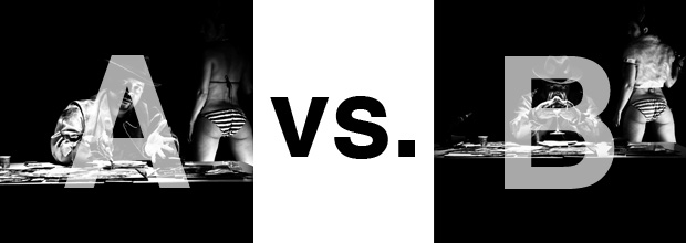
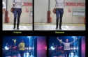
The lead one that shows his face is my fav, but there’s plenty of debate, because the other shot is tough and mysterious. I’ll resist the temptation to make any real case for one or the other, and I’ll let this is a straight up survey – which photo do you like better A (top) or B (bottom)? (please answer in the post, not via other social channels so we don’t have to chase your feedback – thx!)
Here is photo A:
Here is photo B:
Thanks for your input.
||And if you missed it: Here’s the chasejarvisLIVE episode with Mix||











B is better but still lacks that something extra or special.
A is just too much cliche (bad posing)
I like the lighting in both pics though!
Why the girl is not standing on a table and a guy would do his posture between her legs. In this way she’s disturbing element. Retouch her out. Simplify.
B5
PS: Few days ago I did a picture of a guy between women’s legs. It’s on my blog.
A. This is a mysterious picture of sir mix-a-lot and a mystery woman to the right, not a pic of a large butt and a random person in the middle.
Artist will choose photo A, no doubt. It’s a matter of ego!
🙂
I like the pose of B with the wine glass more then the hands on A, but the jacket of the girl distracts me a lot.
It’s distracting so much, I should go for A.