

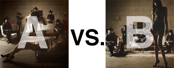
Remember when I did the original chasejarvisLIVE photo shoot way back in winter? If you recall, I was shooting the album cover image for alt/punk country band Brent Amaker and the Rodeo. We also did post production and editing on the images LIVE as well a few weeks after the shoot. Well now it’s time to print these suckers on a limited edition run of vinyl and there is somewhat of a debate on which image is better.
Simply put, and with no further explanation, I thought I’d ask for your thoughts. So which is better, A or B?
Vote in the comments. Also love to know ‘why’ if you care to explain. 500 px wide images after the jump…
[ also, reminder that if you like music and you like chasejarvisLIVE, I’m hosting rising hip hip star RA Scion (of Common Market and Victor Shade) TODAY in 90 minutes at 10:30 pacific/1:30 eastern (GMT – 8). Interview with RA and Village Voice/Time Out/Stranger cultural critic Charles Mudede, plus RA performs LIVE at the end of the show. Hope to see you http://www.chasejarvis.com/live today….]A. With the foreground lady laying down…
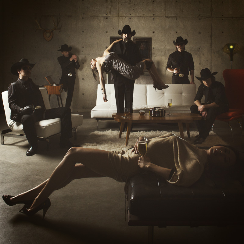
OR.
B. With the foreground lady standing up…
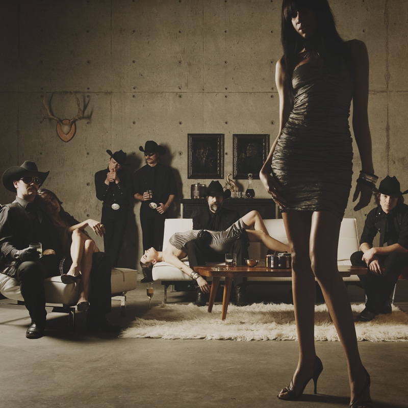
Love to hear your thoughts.








Dude, definatly B. No question. Its a much more saucy image and I like the non symetrical look a bit more. It looks less staged. Plus I think the asian girl looks somewhat awkward holding the champaign glass in A. Great work in both though.
-Jared
I like photo A best because the cowboy is in a stronger position holding the girl while standing, I like the bit of color the red chair brings, and it’s cool how the guys are all equal distance apart. The wine glass is a nice touch, and the pose of the girl is simply hot.
I would have to say A because it highlights the band more then the models, better balance, and the guy standing up holding the girl brings a lot of life to the band more then the models. I feel B does the opposite.
B baby B! The composition flows more; feels more like a captured glimpse…..
I like A because it feels contrived.