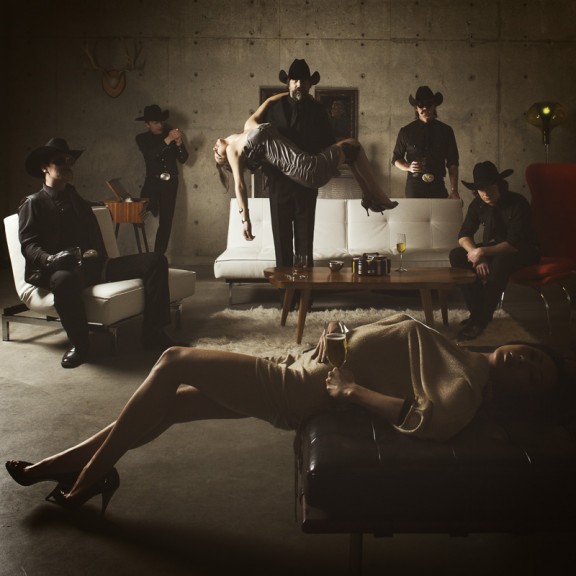
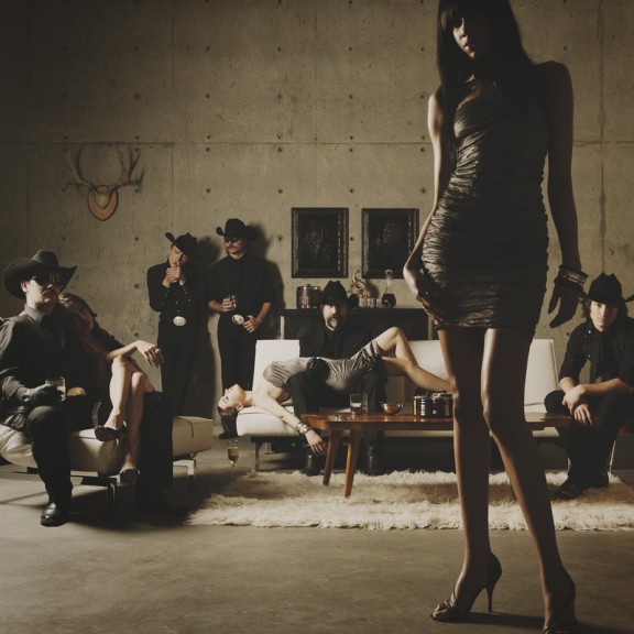
Remember when I did the original chasejarvisLIVE photo shoot way back in winter? If you recall, I was shooting the album cover image for alt/punk country band Brent Amaker and the Rodeo. We also did post production and editing on the images LIVE as well a few weeks after the shoot. Well now it’s time to print these suckers on a limited edition run of vinyl and there is somewhat of a debate on which image is better.
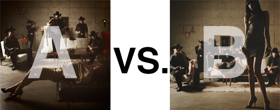
Simply put, and with no further explanation, I thought I’d ask for your thoughts. So which is better, A or B?
Vote in the comments. Also love to know ‘why’ if you care to explain. 500 px wide images after the jump…
[ also, reminder that if you like music and you like chasejarvisLIVE, I’m hosting rising hip hip star RA Scion (of Common Market and Victor Shade) TODAY in 90 minutes at 10:30 pacific/1:30 eastern (GMT – 8). Interview with RA and Village Voice/Time Out/Stranger cultural critic Charles Mudede, plus RA performs LIVE at the end of the show. Hope to see you http://www.chasejarvis.com/live today….]A. With the foreground lady laying down…

OR.
B. With the foreground lady standing up…
Love to hear your thoughts.


Depends on the main purpose of the photo. Is it like a band picture for marketing? or is it a fashion photo shoot? If is for a band promotion or marketing go for A, but if is for a fashion magazine, go for B.
As an album cover I’d choose “B”.
The reason is very simple and practical: bigger room for text on the left side which will be compensated by the standing woman in front on the right side.
But I like “A” too. 🙂
i like both but B has a much better comp than the other , i think on A the girl luying down distracts to much away from the background , but bot are exerllant photos and well lit
I pick B also.
The problem with A to me is that, like some have mentioned before, too symmetrical. First thing I see are 2 parallel horizontal lines formed by the girls and a triangle formed by all 5 guys. It lacks the energy and drama that would otherwise be created by some asymmetry. I like how B uses the girl in the foreground to create a unique asymmetry that generate immidiate intrest to the viewer. The slight issue I have with B is that the foreground girl, who is not part of the main subject, may be taken up too much dominance in the photo. I would probablly move her more to the right and move the guy on the very right to her left. But as it stands right now, B is far better for the impact, the creativity, and the drama it creates.
B is, by far, my favorite.
I don’t like the ‘somewhat symetrical arc-shape’ of the bandmembers in photo A.
It draws an unwanted attention, I guess.
Also the girls seem to have different ‘looks’ in both photos. In photo A, it seems the girls are put where they are to look good/hot. Well lit, boobs up, you get the point.
Photo B uses the girls (imo) in a much more graphic shape, and this compliments the depth and composition. It breaks the image in a nice way, and let’s the band be a part of the image, but not the whole image. Therefor B is my favorite.