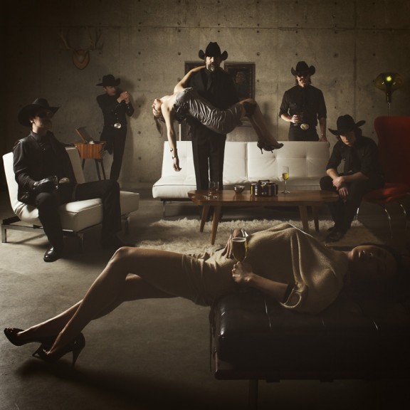
Remember when I did the original chasejarvisLIVE photo shoot way back in winter? If you recall, I was shooting the album cover image for alt/punk country band Brent Amaker and the Rodeo. We also did post production and editing on the images LIVE as well a few weeks after the shoot. Well now it’s time to print these suckers on a limited edition run of vinyl and there is somewhat of a debate on which image is better.
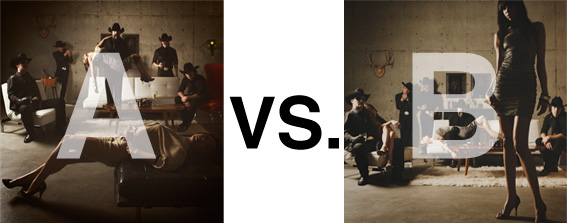
Simply put, and with no further explanation, I thought I’d ask for your thoughts. So which is better, A or B?
Vote in the comments. Also love to know ‘why’ if you care to explain. 500 px wide images after the jump…
[ also, reminder that if you like music and you like chasejarvisLIVE, I’m hosting rising hip hip star RA Scion (of Common Market and Victor Shade) TODAY in 90 minutes at 10:30 pacific/1:30 eastern (GMT – 8). Interview with RA and Village Voice/Time Out/Stranger cultural critic Charles Mudede, plus RA performs LIVE at the end of the show. Hope to see you http://www.chasejarvis.com/live today….]A. With the foreground lady laying down…

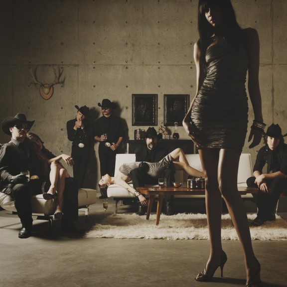
OR.
B. With the foreground lady standing up…
Love to hear your thoughts.


Hmmm…oh, my, jboog! You’ll have a stage. Hadn’t even noticed.-martiniSent by way of BlackBerry by AT&T
Just wanna remark on couple of general items, The website style is perfect, the subject matter is rattling very good
A, it has more boobs.
A is an amazing and more of an “in your face” image. For the cover I would always chose B. It forms a great cover just like all great covers along Musical history – Subtle and atmospheric.
To answer the question, “A” is better. “B” could’ve worked if the model was on the side (the poor guy next to her is practically squeezed out so it doesn’t look natural, it’s distracting). Picture “A” would’ve been better if the guy in the middle wasn’t carrying the girl (it doesn’t make sense why he would be carrying her). Again, it’s distracting and doesn’t add to the picture.
Having said that, I love your work! You rock, Chase!!! You’re my hero!!