Knowing how to deliver images that play nicely with the current design trends is paramount for any working photographer. But why does one orientation work better than another? My friend Sohail breaks it down in the article below: Horizontal versus vertical and why wide design is pervasive and catching on. Take it away Sohail. – Chase
Thanks Chase. Changing habits is tough. I used to, for the most part, use my iPad in portrait orientation. Now I’m trying to break that habit.
Ditto for things on the shooting side. At one point, I used to leave a vertical grip on my DSLR and shoot in portrait mode. Most of what I shot was vertical, and I loved it.
Now? Not so much.
I’m shooting more horizontals. I’m consuming more content in that orientation too. And, like any self-respecting geek obsessed with the underlying reason behind things, I wanted to know why.
I think I’ve figured it out.
1. Tension and space
“Fill the frame.”
Every photographer I know says this. Some are starting to move away from that, but getting closer is generally considered to be a good thing.
I haven’t changed my mind about that, but I have noticed that there is a marked difference between getting closer to your subject while in a vertical orientation versus a horizontal orientation.
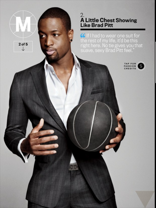
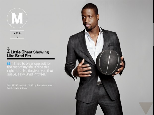
Take the image of Dwayne Wade from a past issue of GQ. Here, in the iPad version of the magazine, the example makes much more sense.
In the vertical orientation, Wade’s cut off at, well, his crotch. Or, fine, at the hem of his jacket. He fills the frame, and it’s a great shot (totally dig the suit, by the way).
But look at the same image in the horizontal. Here, he’s cut off mid-thigh, and he’s looking off to camera left. There’s space, filled with text and graphics, and there’s breathing room on his sides.
In the first image, he’s being crowded. There’s tension there, but it’s the not-so-good type. He’s looking off the edge of the photo, and there’s almost no room for him to move.
In the second image, his gaze has a direction to go in. You can imagine D-Wade feinting to the left, or pulling back to the right. There’s tension, but it’s the kind of tension that comes from what I think of as potential motion.
That’s the good kind of tension, the kind that exudes an energetic vibe. Horizontally, you get it. Vertically, not so much.
2. Context and room
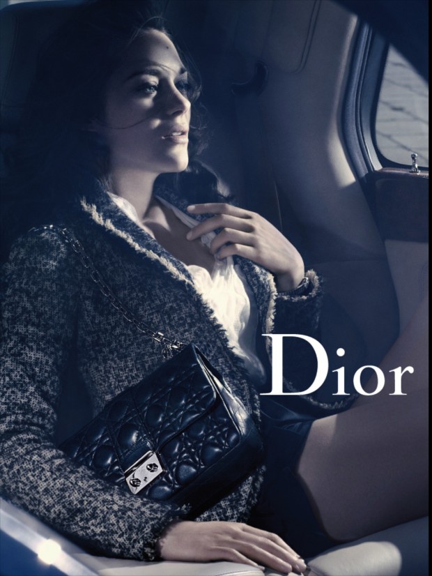
Take this image from a Dior ad. In the vertical, you see the model, you can see that she’s in a car.
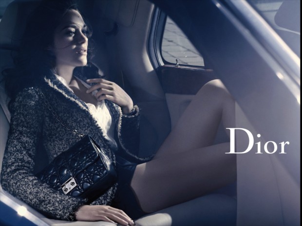
Switch that out to the horizontal, and… what changed?
She’s still in the same car. She’s still in the same position. Nothing’s changed, except the space you can see in the photo.
I argue this: in the horizontal, she seem more comfortable. Less cramped. She’s got room to move, room to shift.
That room is what makes the horizontal image seem more luxurious than the vertical. I look at that vertical, and I think, “Yeah, she’s in a car. It’s probably a nice car.” The horizontal image, however, changes that to “Oh yeah, she’s definitely in a nice car. Look at how she’s chilling in that seat, look at all that room.”
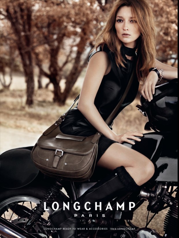
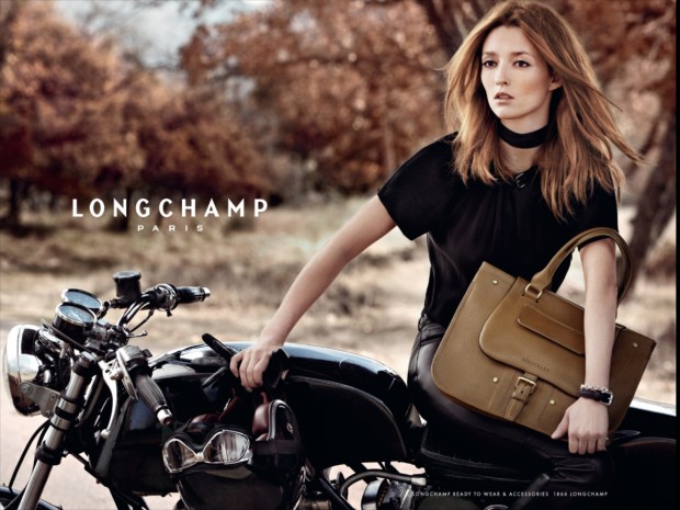
Context is another reason why I’m digging horizontal images more. This ad from Longchamp Paris is an excellent example. The vertical focuses on the model and the bag, which is fine. she’s at edge of the frame, an elbow cut off. Nice image, but again, all I can see is that she’s on a motorcycle on a country road.
Cue the horizontal. Now it’s a whole new story.
The motorcyle is vintage. The helmet and goggles in her right hand could be straight out of the forties, fifties, maybe sixties. That adds context to the image, gives it a sense of place and time.
It makes the image come alive with meaning, and you buy into the picture of motoring down a French country road on a vintage Triumph, this gorgeous woman with her Longchamp Paris bag hanging on to you.
That’s context.
3. We see horizontally
Okay, human vision isn’t really horizontal or vertical. But I do think we see things primarily on the horizontal axis. We read either left to right or right to left (the Chinese and Japanese systems being the notable exception). We see things that are in a horizontal panorama that stretches across our vision. How often do you look up and down, versus side to side, when you’re just walking around?
Visually too, we are trained to see things in the horizontal. Your TV is a widescreen, as is your laptop’s screen. Movies are made in widescreen, not narrowscreen. You drive, you scan left and right, because there’s no reason for you to look up.
I argue this: the horizontal is more natural for most people.
iPhone users – do this. Take out your iPhones and make a quick video, with your phone held vertically.
Now make the same video, but switch your phone to the horizontal orientation before hitting the record icon.
Which one’s easier to watch?
The when and why of vertical
Verticality (yes, it’s a word) is around us. It’s pervasive too. Our book pages are vertical. Our magazines are vertical. I thing that human beings prefer to read in narrower columns than wider ones.
The vertical page is more convenient to hold as you read it. I can hold an 8.5 x 11 page quite firmly along one edge, with one hand, as I read it, but if I switch it to horizontal, I have to use both hands.
That’s why magazines have been vertical, I think. It’s a lot easier to read a magazine with one hand if you’re holding it vertically.
But in case it hasn’t escaped your notice, most situations where the vertical is more appropriate have to do with the written word – and even there, as I said, we still manage to insert a bit of horizontality (yes, also a word) by reading left-to-right or right-to-left. For images, I think, by and large, that we prefer the horizontal over vertical.
Final word
My iPad is more comfortable to hold vertically. There’s no denying that. When I hold it horizontally, I feel like I’m cantilevering it with my hand. It’s annoying.
But honestly? It’s a small price to pay, because I enjoy looking at images a lot more. Photographers often realize this; guys like Michael Nichols and Steve McCurry, who are selling apps comprised of their work, don’t even offer you the option of viewing the app in portrait orientation.
Gannon Burgett over at Gizmodo recently did an article titled “13 Design Trends for 2013.” One of the trends (number 7) was “Wider Websites.” He writes:
By offering wider websites, it also allows for visual media to be more prominently displayed alongside the text. A picture can speak way more than a thousand words in some cases and having a beautiful photograph at 700 pixels doesn’t do it justice.
I argue that this design trend also holds true for just pure images.
Sure, there are images where the vertical works better. I once saw a great image of a kayaker about to go over the edge of a waterfall that must have been about a hundred feet high. In that shot, a horizontal might not have conveyed the gravity (no pun intended) of the situation.
Yet I find that these circumstances are few and far between. For me, at least, landscape works better than portrait, and I’m happy to accept that the new horizon(tal) is here, at least until something comes along to beat it.
PS – Have you checked out Affinity Studio, Nano Banana and Meta AI? Great free alternatives to Adobe Creative Cloud and Midjourney.




Hello my loved one! I wish to say that this article is awesome, great
written and include approximately all significant infos.
I would like to see extra posts like this .
When I initially left a comment I appear to have clicked on the -Notify me when new comments are added- checkbox and from now on each time a comment is added I receive four emails with the same comment. There has to be an easy method you are able to remove me from that service? Thanks a lot!