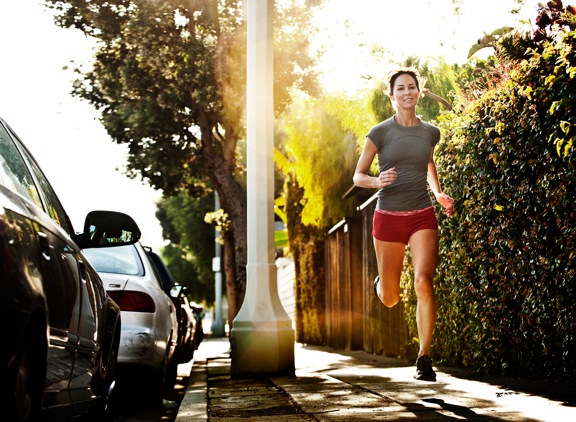
I was just recently commissioned for a campaign and shot about 1000 images to capture final image for this well known sports company. In the end, it came down to the two images above. As is usually the case, the final image is tough to choose, with lots of factors under consideration, lots of stakeholders picking their favorite. There was much debate.
I’ve posted stuff like this before and was really excited by the resulting discussion, so I figured I’d throw it out there again… WHICH IS BETTER, A or B?
Vote in the comments. Love to know ‘why’ if you care to explain your thoughts. 600 px wide versions of each image after the jump…hit [‘continue reading’ below]. After you all weigh in, I’ll tell you which one was used and why.
This is PHOTO A, below.

THIS is PHOTO B, below.


A gets my vote
In B she looks like she’s about to be abducted by aliens, but the flipside is that you see less of the cars.
If you could cut the flare by 50% and/or shift it left then B would be the winner
CW
A gets my vote
In B she looks like she’s about to be abducted by aliens, but the flipside is that you see less of the cars.
If you could cut the flare by 50% and/or shift it left then B would be the winner
A for sure!
I prefer A. I find it has a more realistic feel to it. However, B gives it more of a fantastic feel.
Both good eye catching shots. my vote for A because for obvious reasons I’m a guy and want a better look at the girl. For tech reasons: it’s cleaner more natural looking than shot B with it’s extreme light blaring in the shot. I do like that effect (which i have seen in your pictures a lot) but here this seems like it dosen’t work because the overall feeling of the whole shot is a “Captured in the moment: type shot and the blaring light makes it look unnatural which I feel most commercial stills suffer to much from, which is that fake manufactured look.
Your a awesome photog get rid of that crazy nuclear blast of light.