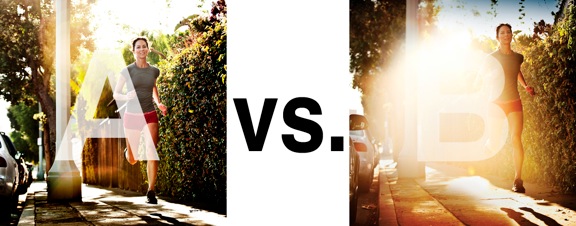
I was just recently commissioned for a campaign and shot about 1000 images to capture final image for this well known sports company. In the end, it came down to the two images above. As is usually the case, the final image is tough to choose, with lots of factors under consideration, lots of stakeholders picking their favorite. There was much debate.
I’ve posted stuff like this before and was really excited by the resulting discussion, so I figured I’d throw it out there again… WHICH IS BETTER, A or B?
Vote in the comments. Love to know ‘why’ if you care to explain your thoughts. 600 px wide versions of each image after the jump…hit [‘continue reading’ below]. After you all weigh in, I’ll tell you which one was used and why.
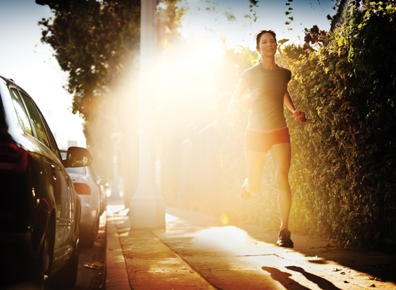
This is PHOTO A, below.

THIS is PHOTO B, below.


A, but I like the facial expression and positioning of the runner in B more.
B suck major ass
Definitely A
Photo A
B for me definitely. I like the way the the glare removes the less important details, leaving the eyes to focus on the runner and part of the cars telling there’s a road beside. The shadow below the runner in B also gives a deeper impression of a morning/evening run.
The glare on B though is much too centered imo(i liked the square-cropped version), does feel a tiny bit unrealistic but I would still go for B comparing both photos.